Summary
During the Spring 2024 semester, a new cohort of students advanced ideas for improving campus orientation and navigation by designing a pedestrian wayfinding system. This new system applied Navigator Type research and Mobility Marker design concepts to visual affordances in the campus environment, such as campus boundaries, popular destinations, timed routes, cardinal directions, and ground-level information situated in the gaze of heads-down phone users.
Project Timeline: 4 Months
Click to skip to presentation ⤵
My Role
Position: Team Member
Responsibilities: I helped research the student body regarding wayfinding around the UT Austin campus. Collectively as a team ideate ideas and prototype them. Conduct user testing and apply insights. I focused primarily on Cardinal Directions.
Teamwork: Collaborated with 4 team members [Abigail D, Abraham N, Nidhi P, Rumi S.], guided by Jon Freach.
Stakeholder: Austin Transit Partnership
Problem Description
Students struggle to find routes and mobility modes that work for them and are always seeking to optimize their journeys. There is a need for visual markers and physical affordances that, inform, signal, and support mobility on and around campus.
End Goal
Enhance students' mobility around campus in preparation for the future installation of a light rail in Austin. More info here
Process
Familiarize
We began by familiarizing ourselves with the previous semester’s cohort work, gaining context on their research and project direction. Their focus centered on how UT Austin students navigate transportation on and around campus. You can explore their research here.
Understanding Light Rail Implementation
We then sought to develop a foundational understanding of light rail systems: how they function, how users interact with them, and the experience they provide. Our exploration included existing systems and the specific context of Austin’s upcoming implementation.
Reinvent
To create lasting impact, we set out to build upon the research from last semester while expanding our own direction. Our goal became clear: enhance student mobility on campus by integrating past insights with our new ideation.
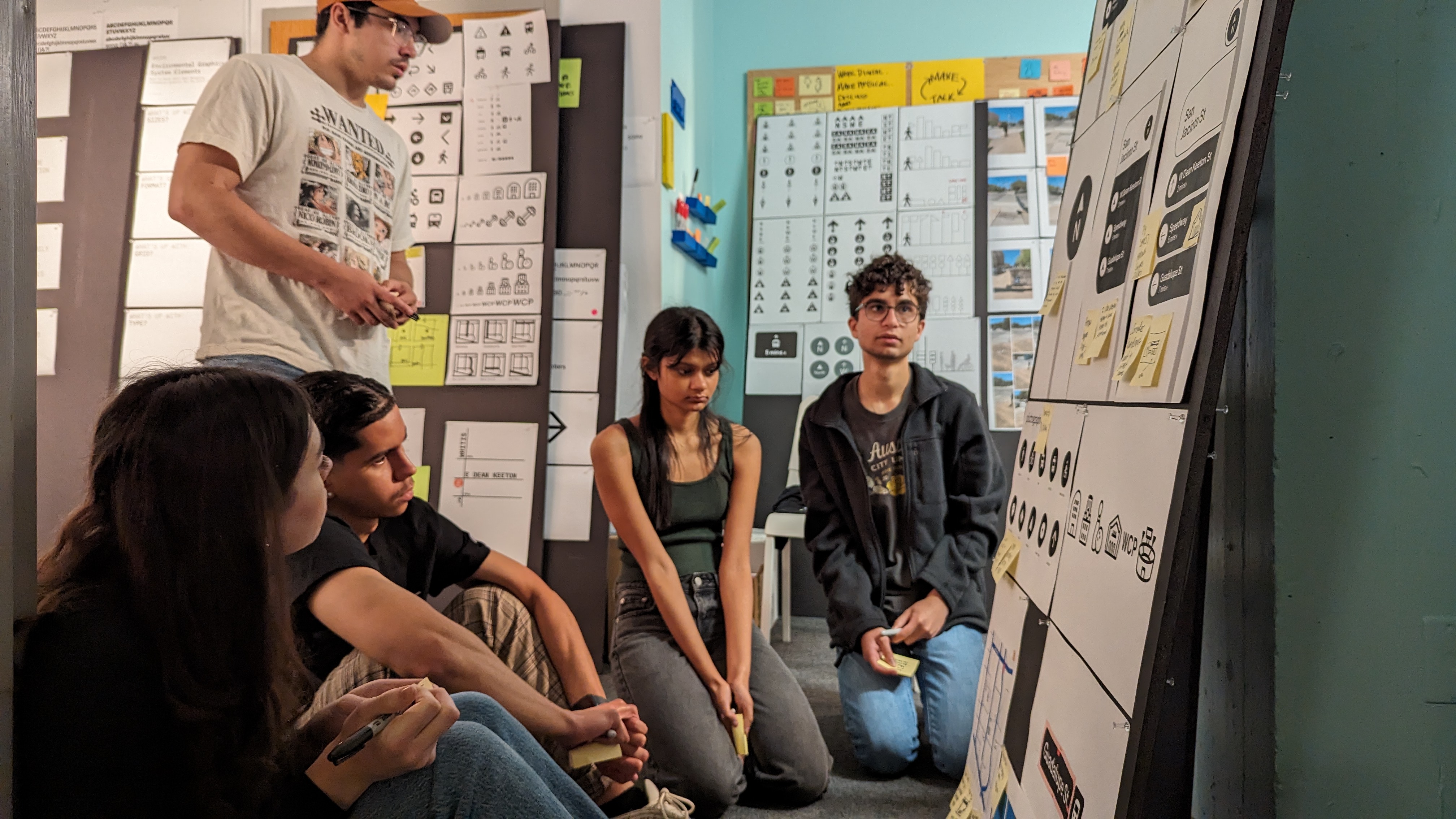
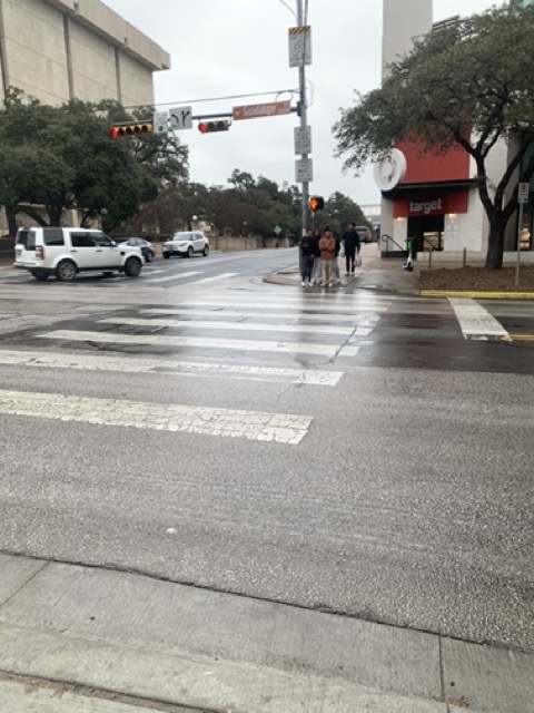
Phase One: Observation
Ethnographic Study
During this phase, we each visited the three identified Mobility Waystation locations on campus to observe movement and behavior in real-time.
The primary Mobility Waystation locations observed in Austin, Texas:
- 24th & Guadalupe
- 23rd Street Square
- 21st & Guadalupe
We conducted ethnographic research using a framework that captured the following dimensions: Space, Actor, Objects, Interactions, Flow, Needs, and Feelings.
Primary Key Findings
- Students often look at the ground level when navigating their route.
- The majority of students focus on their phones while walking or waiting to cross intersections.
- At crosswalks and stop signs, attention remains downward, away from environmental cues.
- Micromobility clutter like e-scooters blocks sidewalks and disrupts pedestrian flow.
- Temporal variations: Rush hours show significantly different behavior patterns than mid-day or evening.
- Low social interaction: People tend to isolate themselves in public space, specifically when waiting, limiting community engagement.
Phase Two: Ideation
Design Criteria
As a team, we collaboratively established our core design criteria. These acted as guiding principles for developing thoughtful and impactful solutions.
Inform
Our design must communicate accurate and timely information effectively.
Compel
Our design should encourage students to explore and adopt new forms of mobility.
Include
Accessibility is key—our design must consider and accommodate a broad range of student needs.
Engage
Interaction is central—our design should foster meaningful connections between people, place, and movement.
Integrate
The solution must harmonize multiple mobility modes seamlessly across campus spaces.
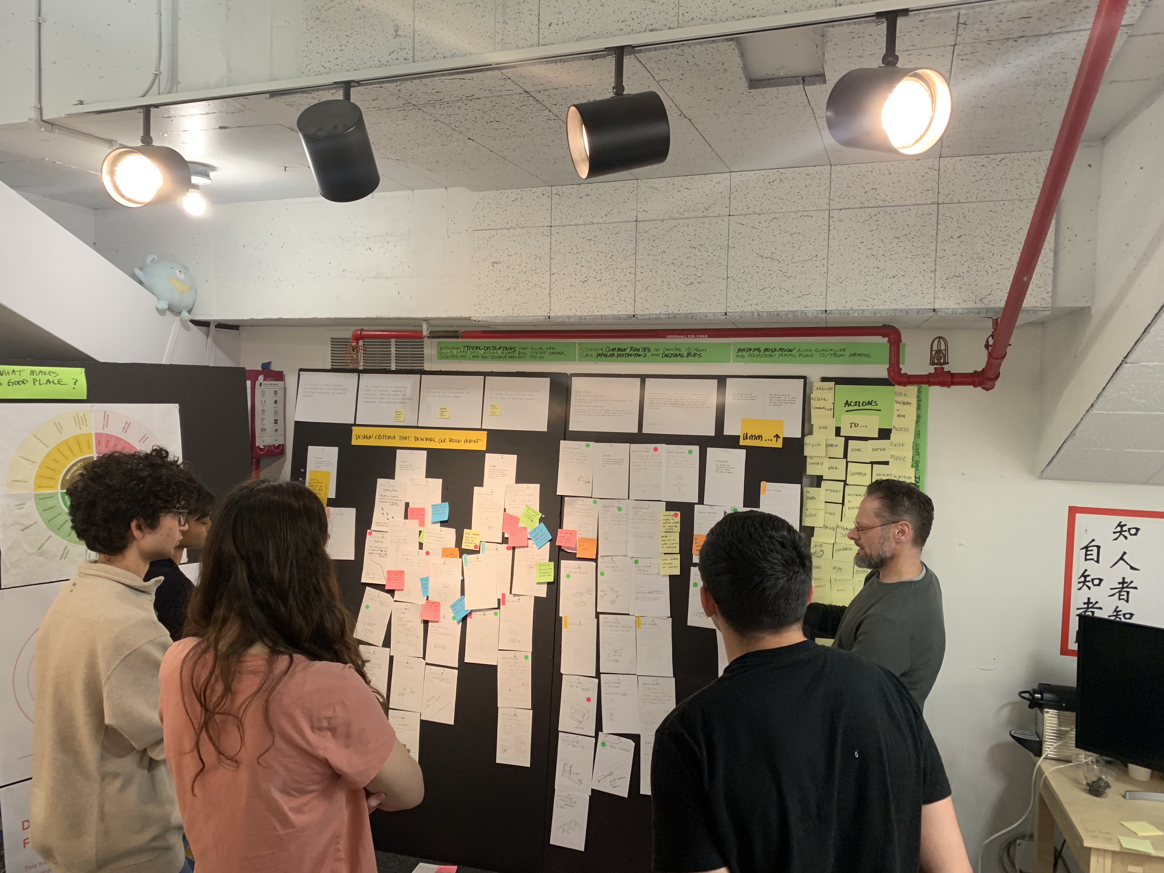
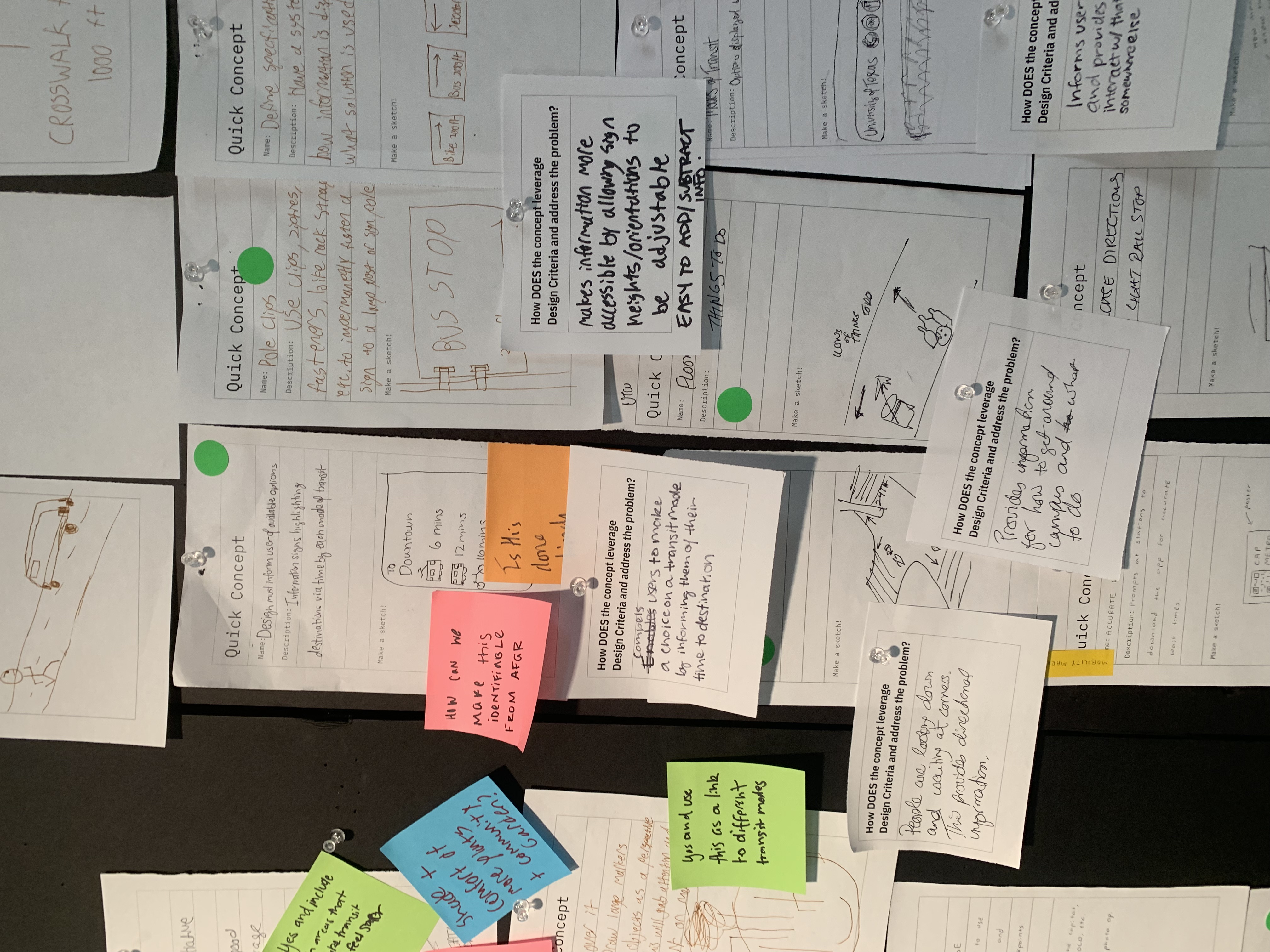
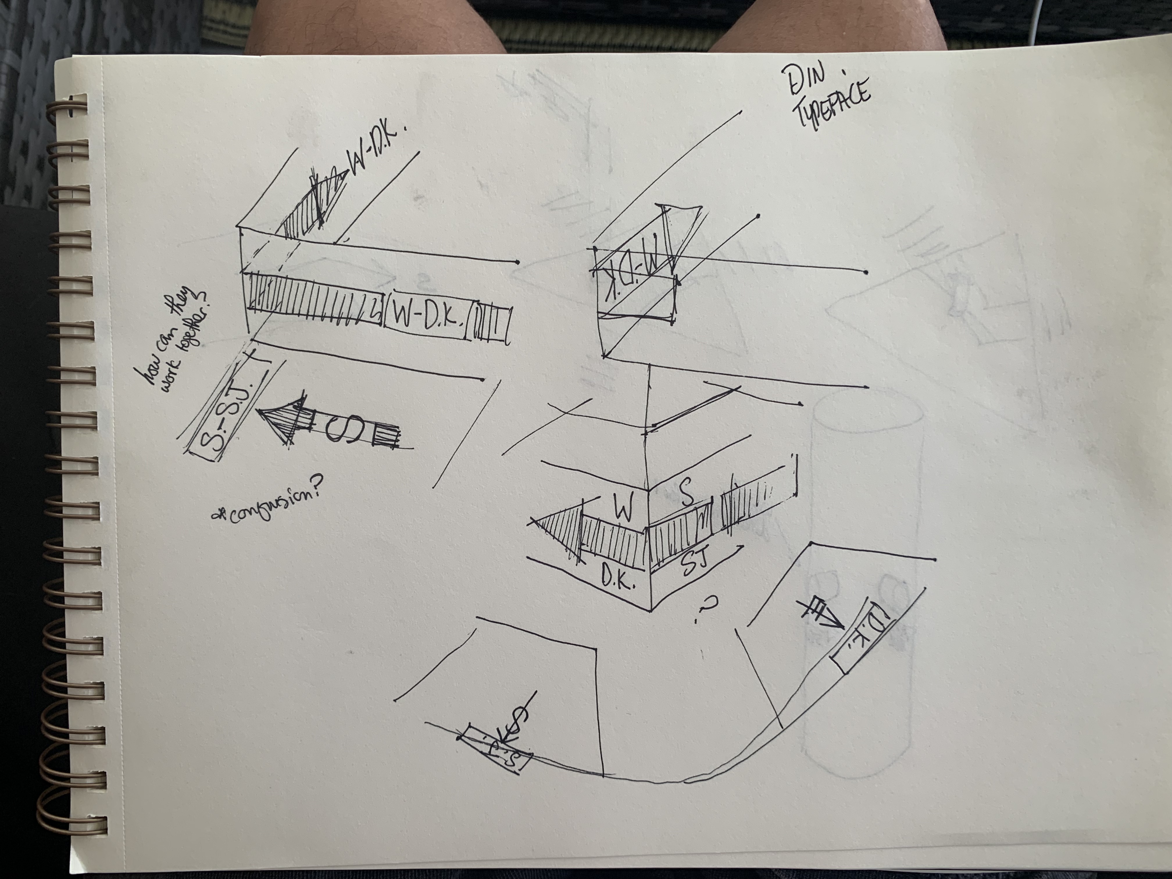
Formulating Ideas
Each team member created quick concept sketches to explore potential directions. We then critiqued and discussed the sketches together, identifying the strongest concepts that both aligned with our design criteria and represented feasible, real-world solutions.
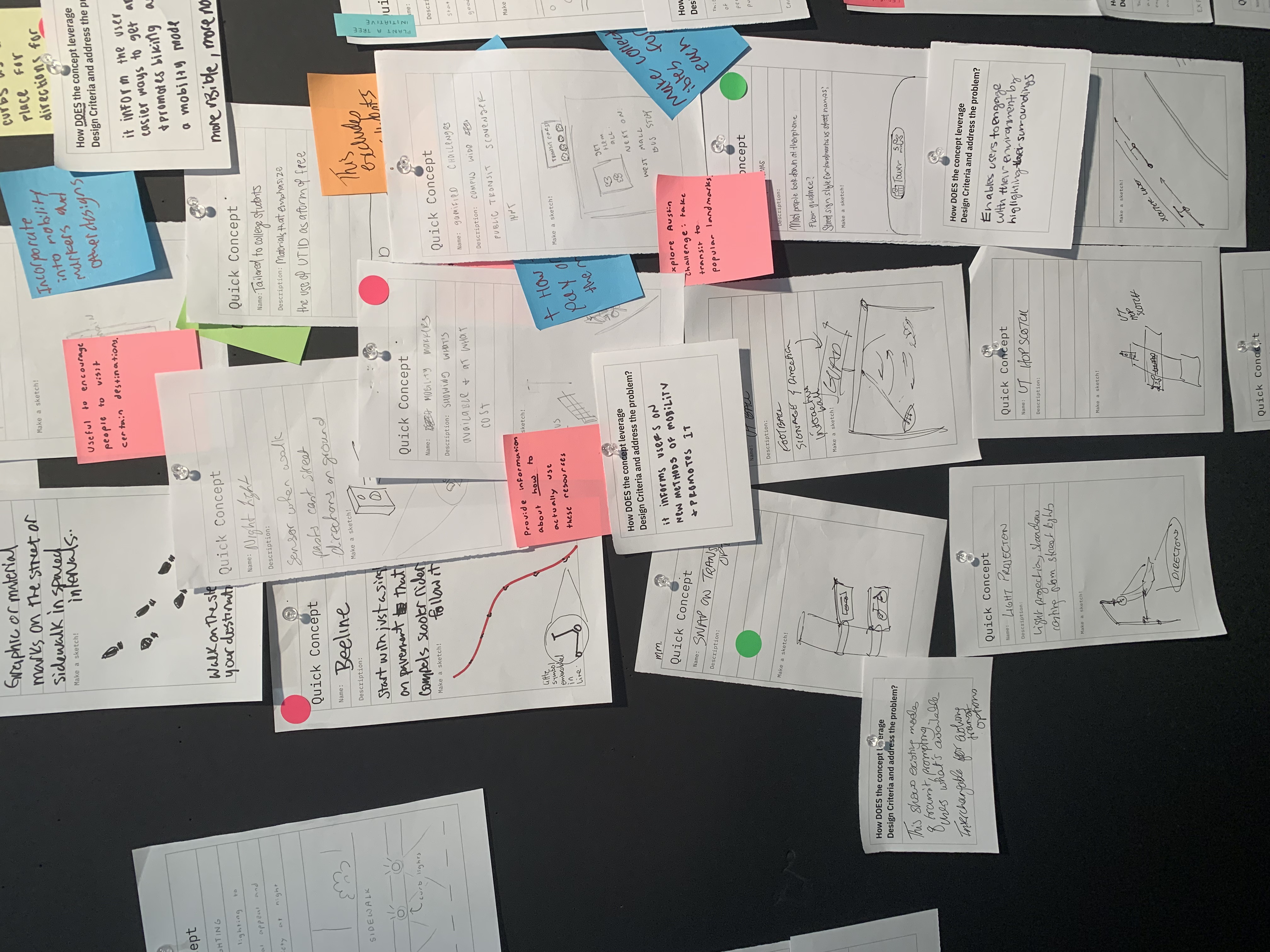
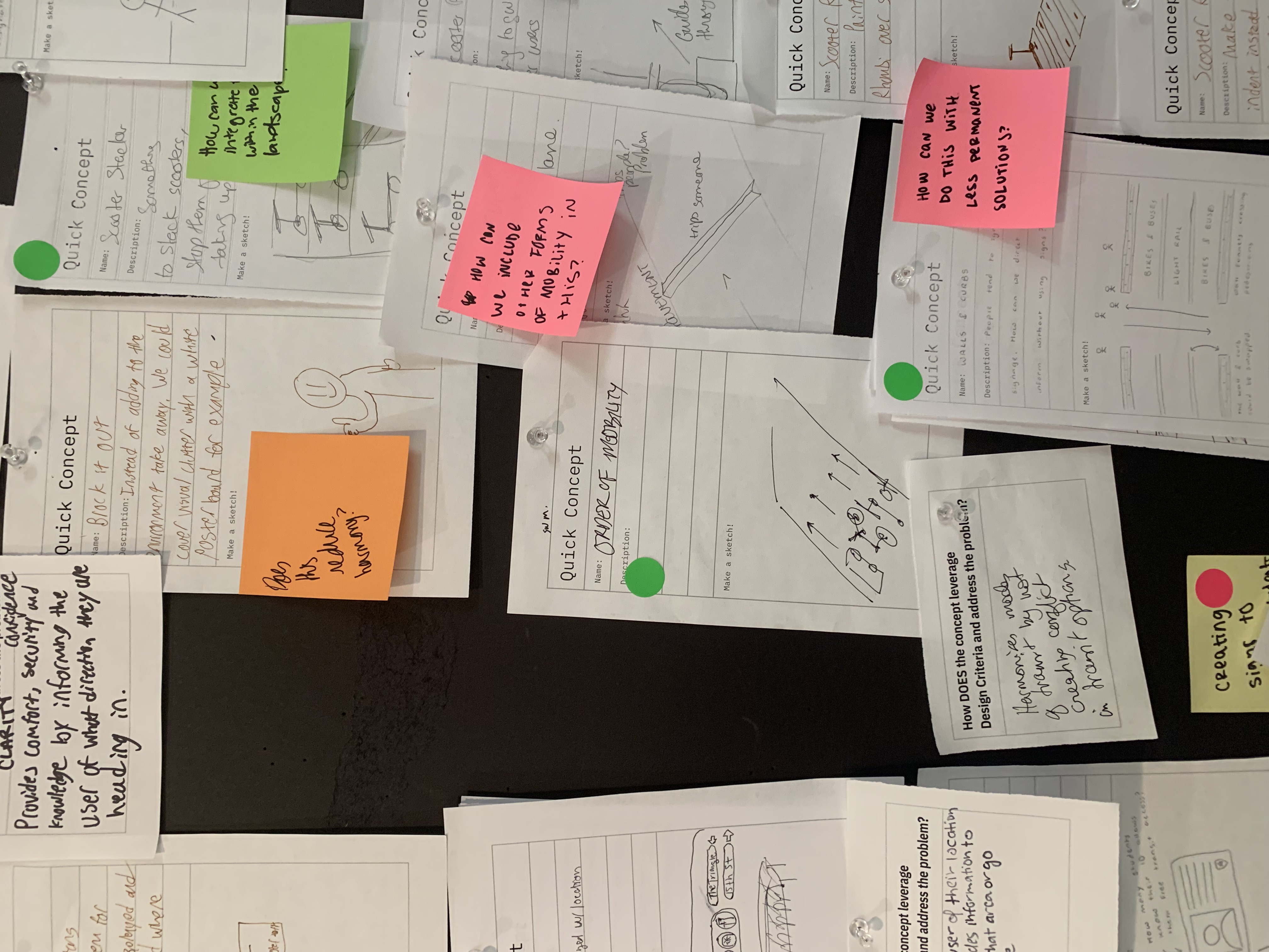
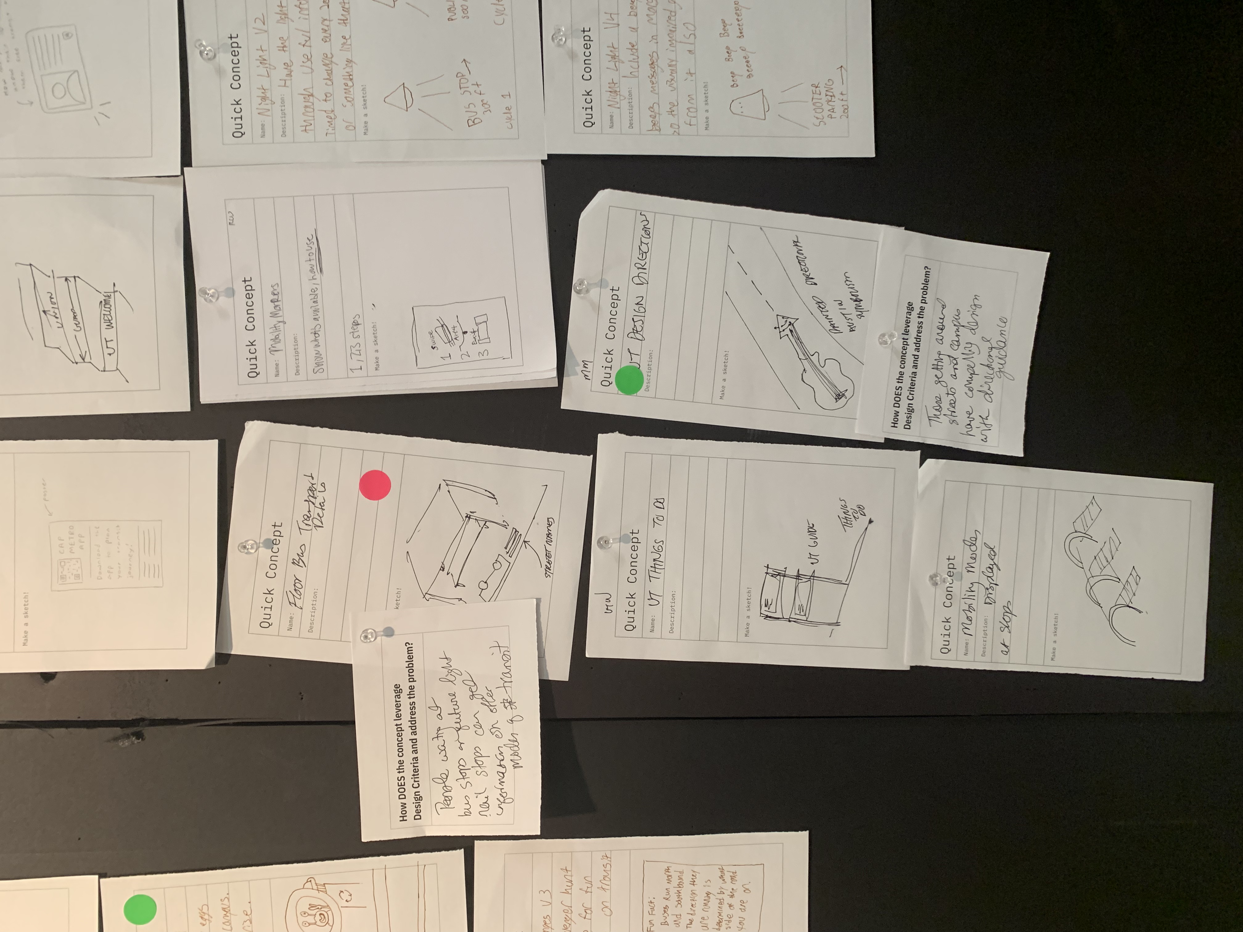
Phase Two: Categorizing Our Concepts
The Three Mobility Enhancers (Categories)
From our initial concept sketches, we identified and organized our mobility solutions into three primary categories:
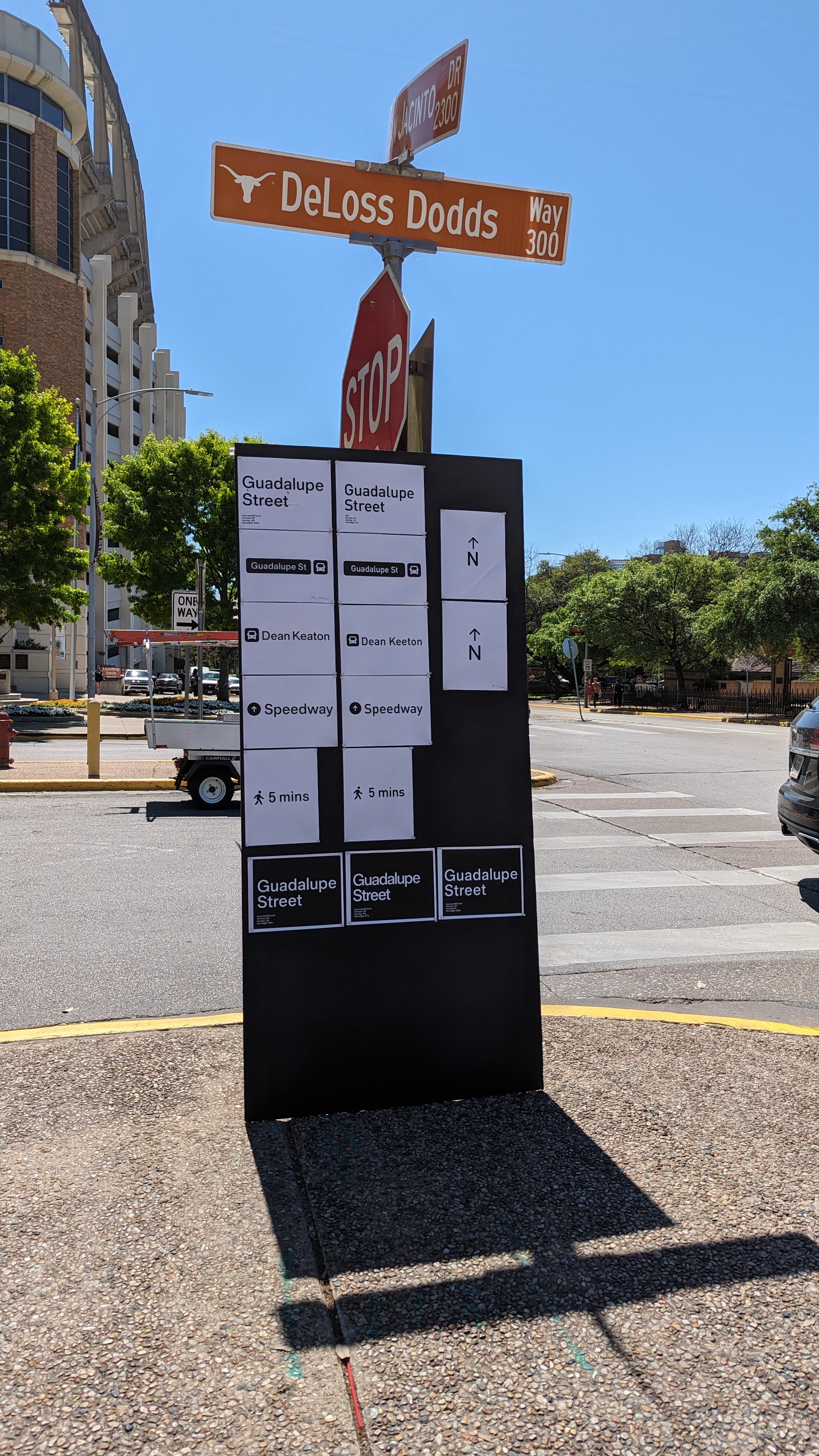
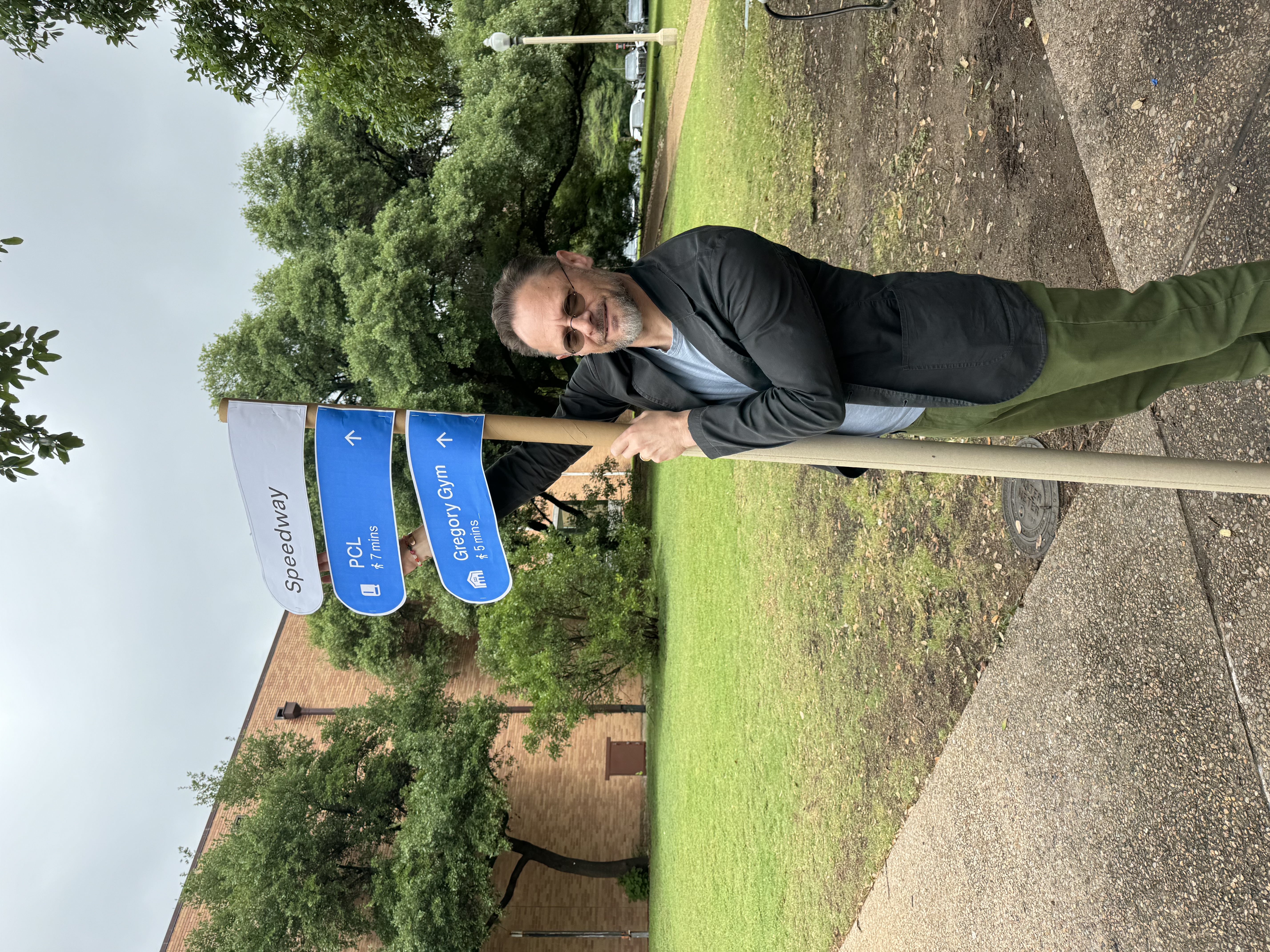
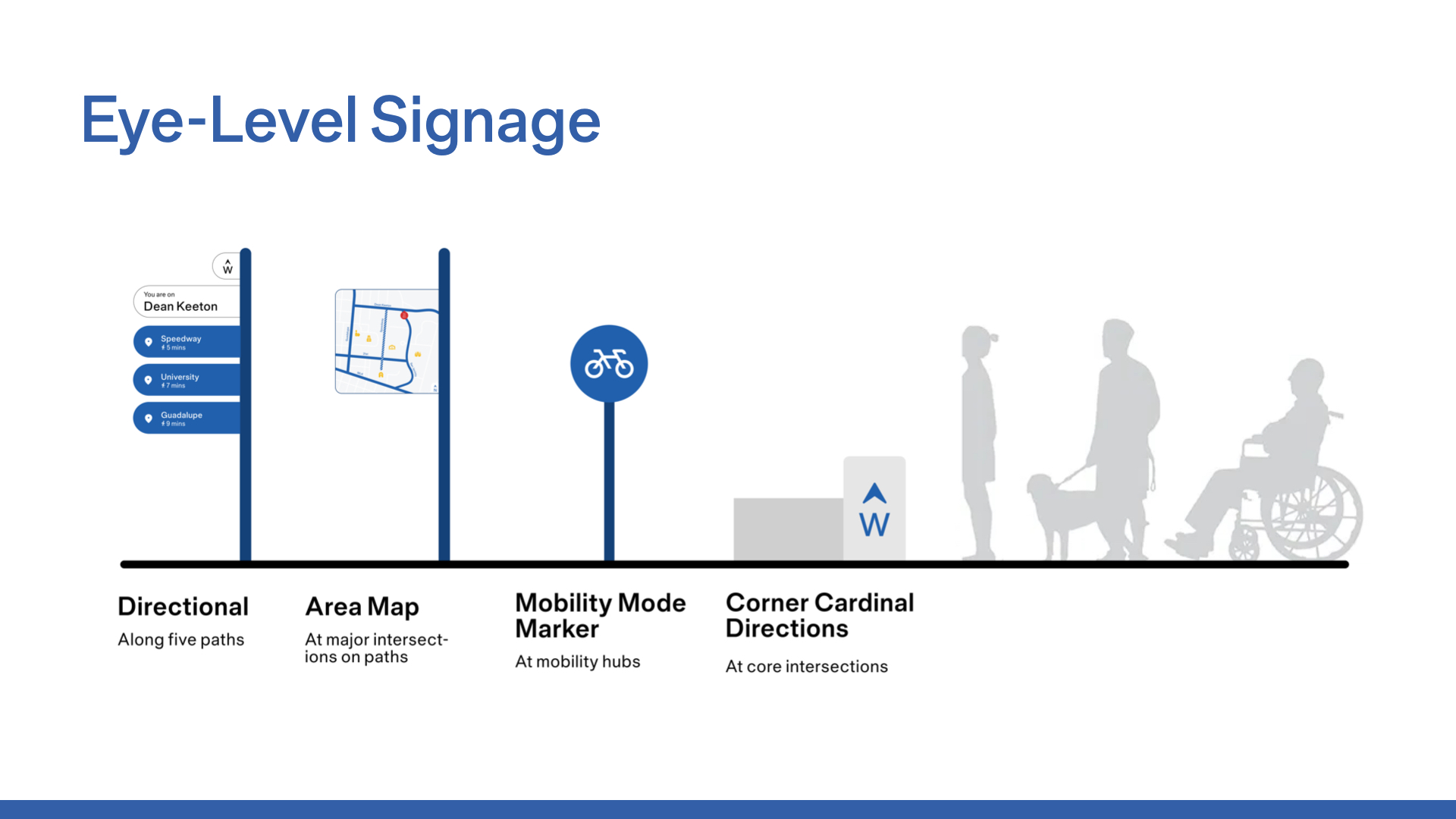
Directional Sign
Eye-level signage that helps guide users throughout campus in real-time.
Area Map
A map that highlights major campus locations and key points of interest.
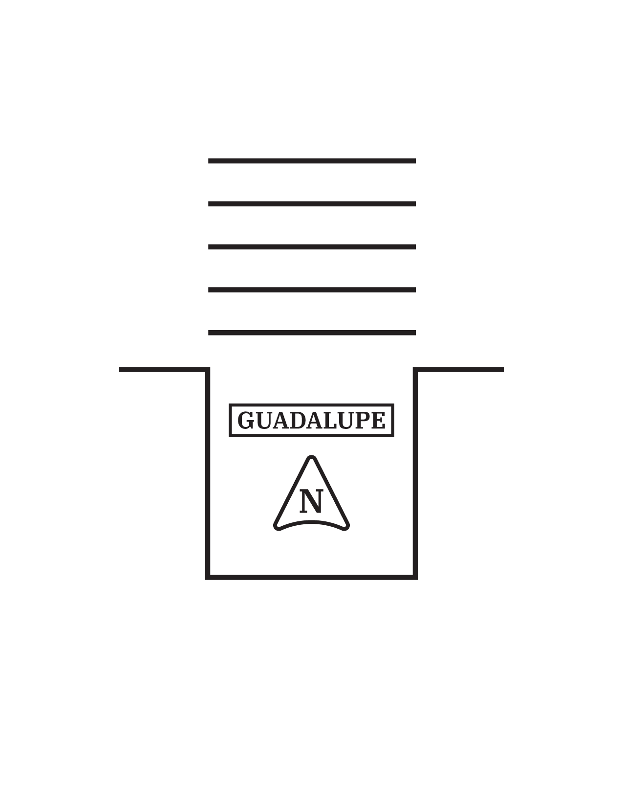
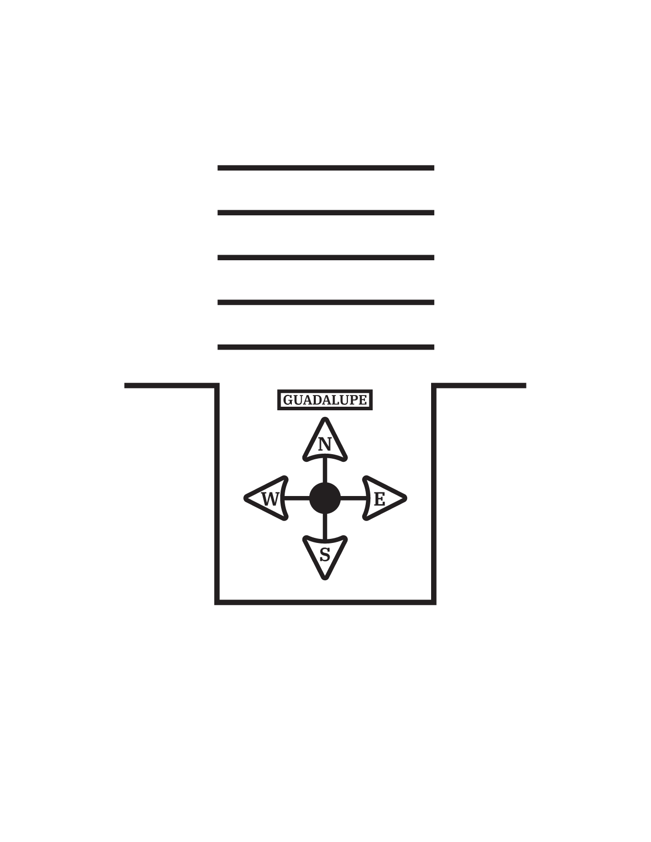
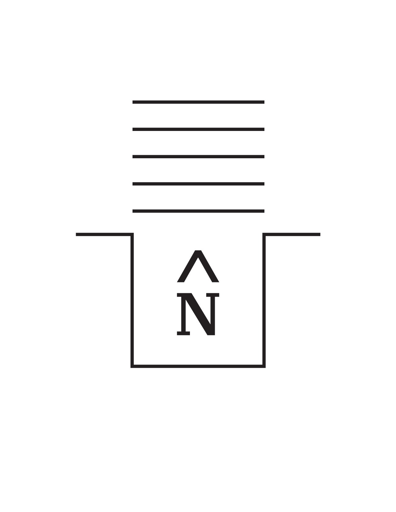
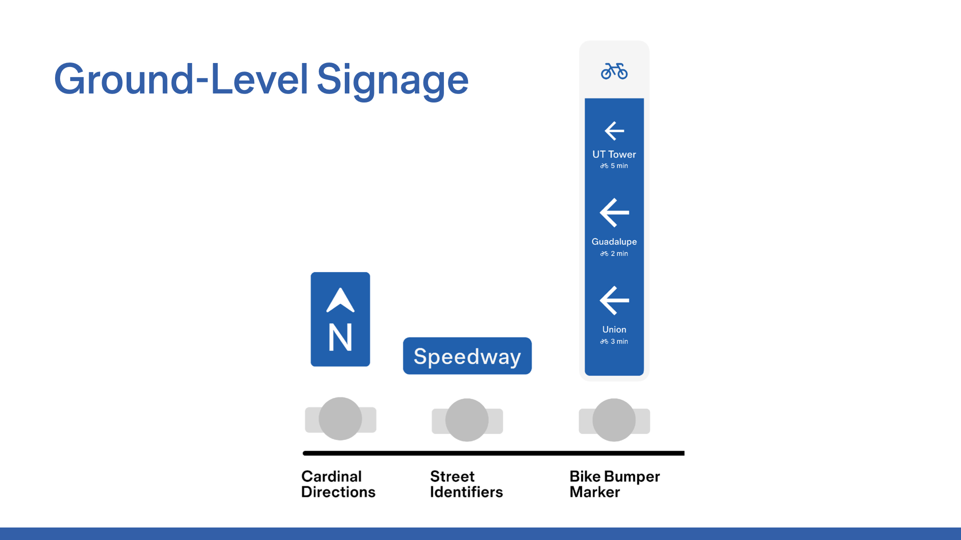
Ground-Level Directions
Wayfinding tools and directional cues placed below eye level, such as floor decals and arrows.
This structure allowed us to divide and conquer, splitting into smaller focus teams. Even while working independently, we continuously shared feedback and collaborated to align ideas and maintain cohesion.
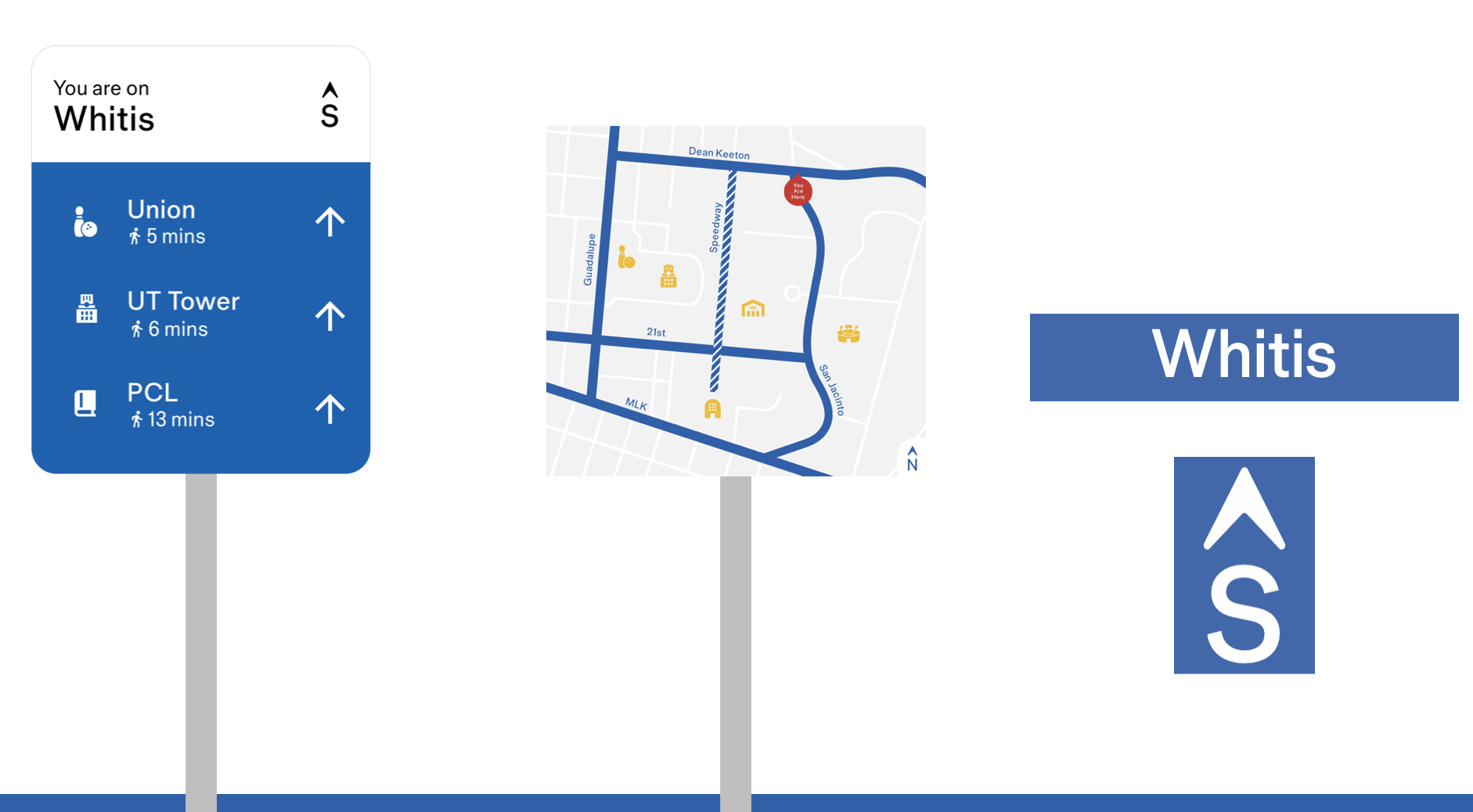
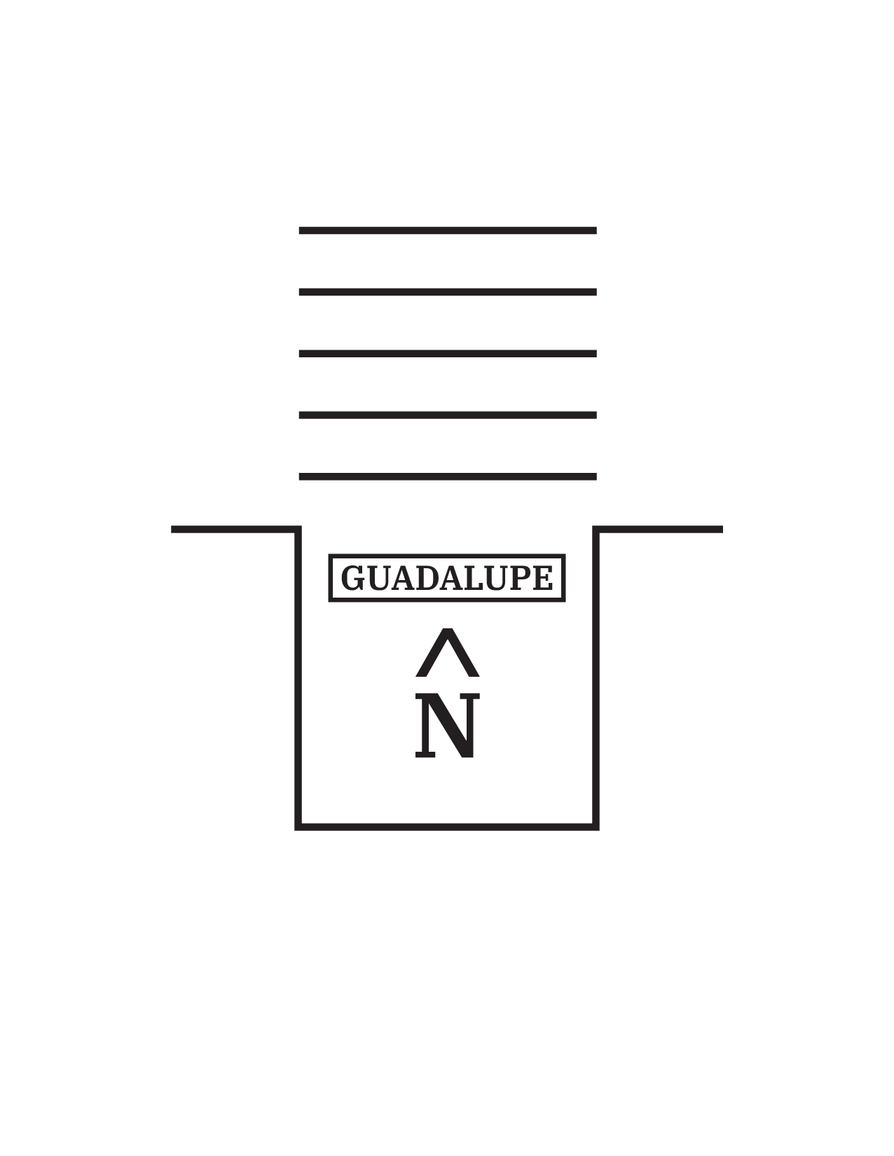
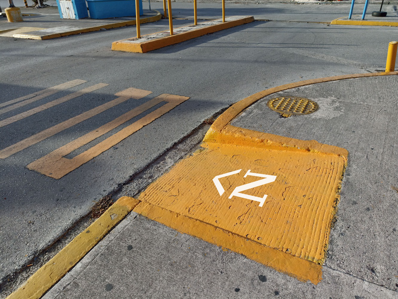
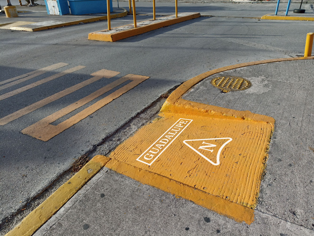
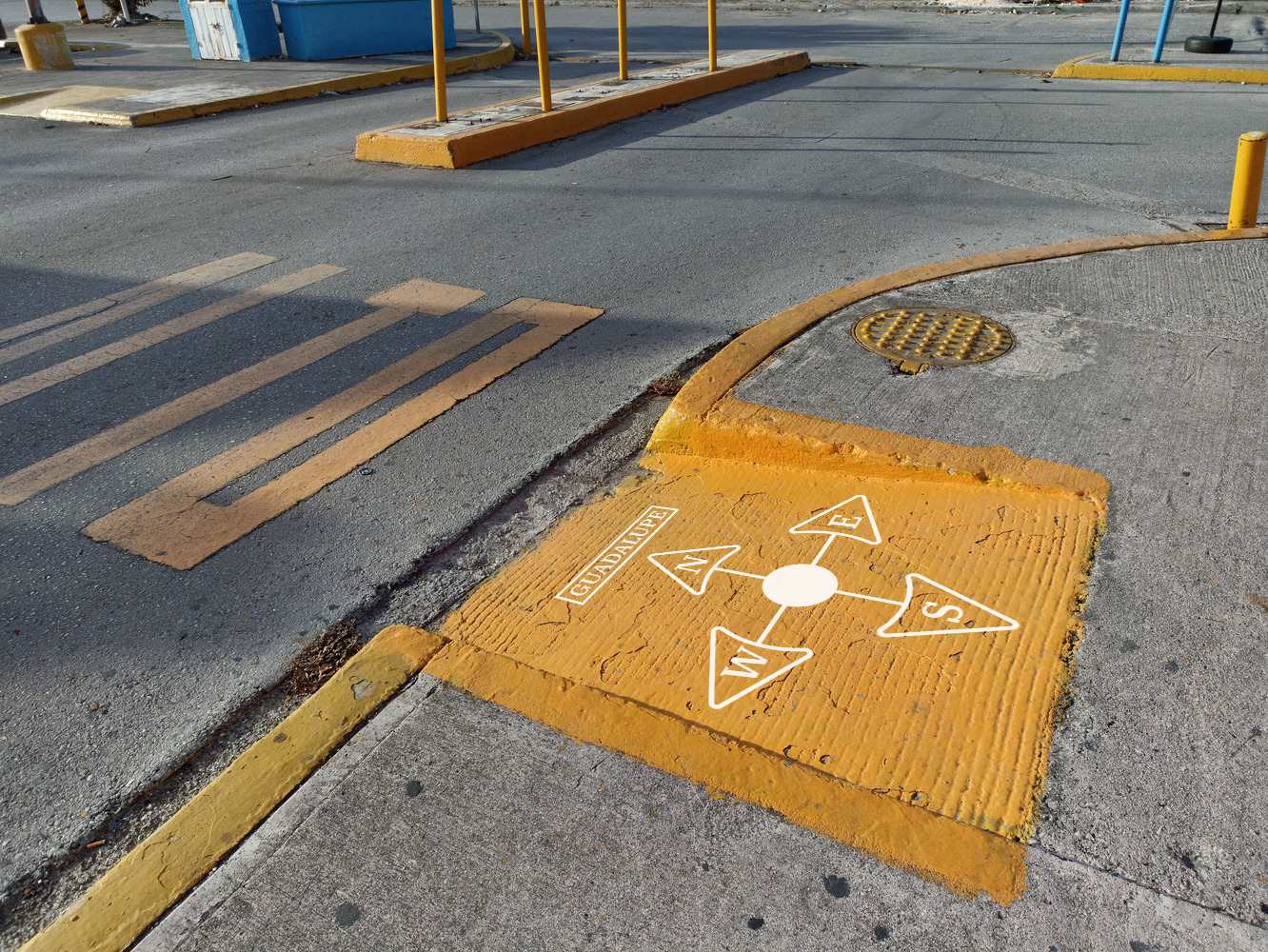
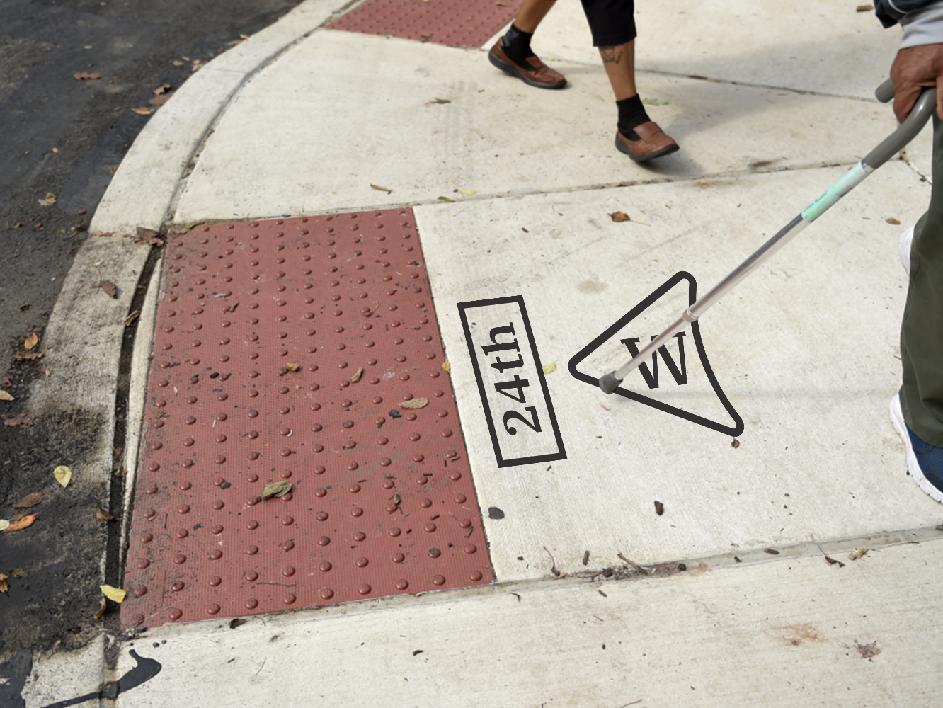
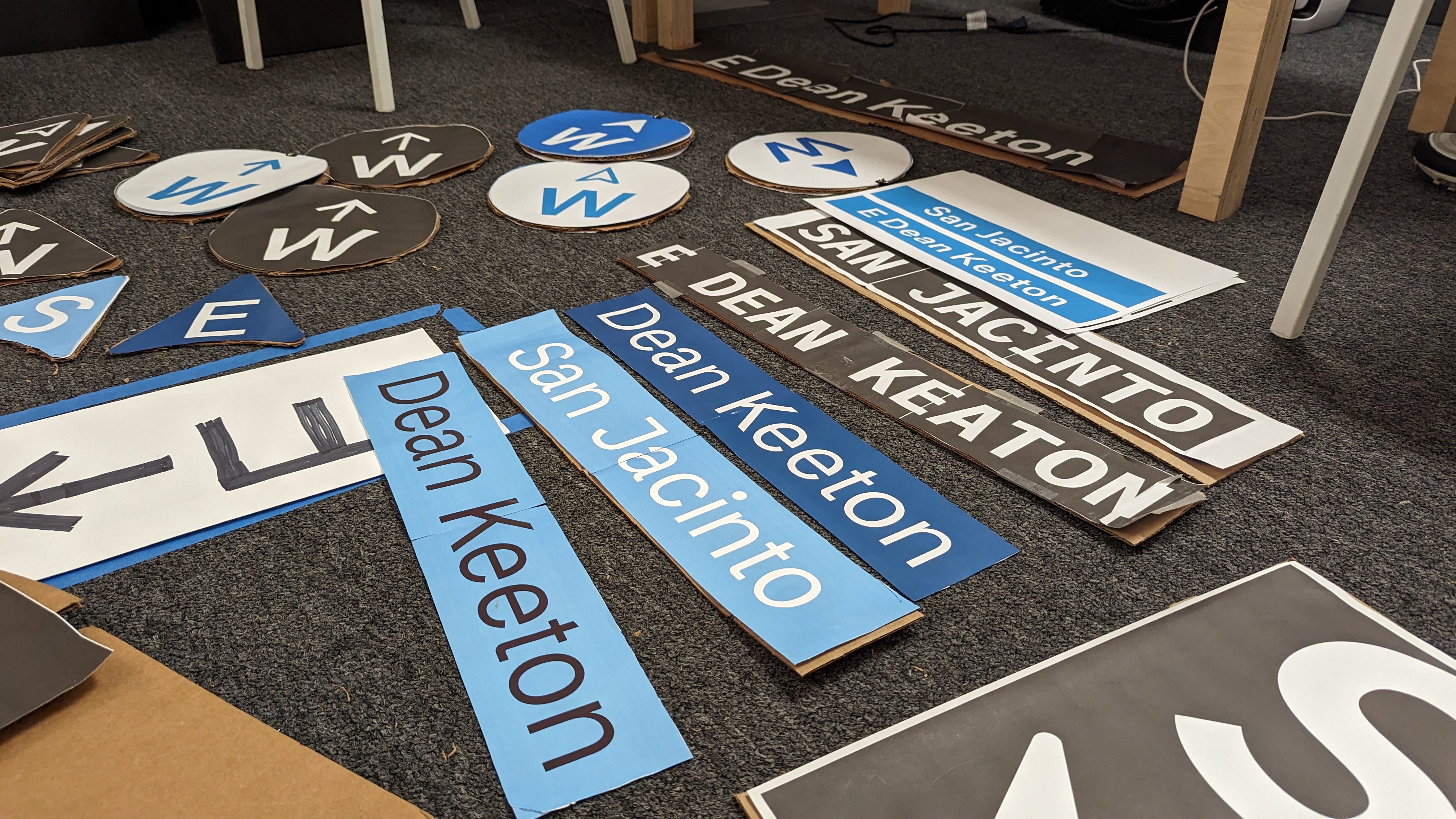
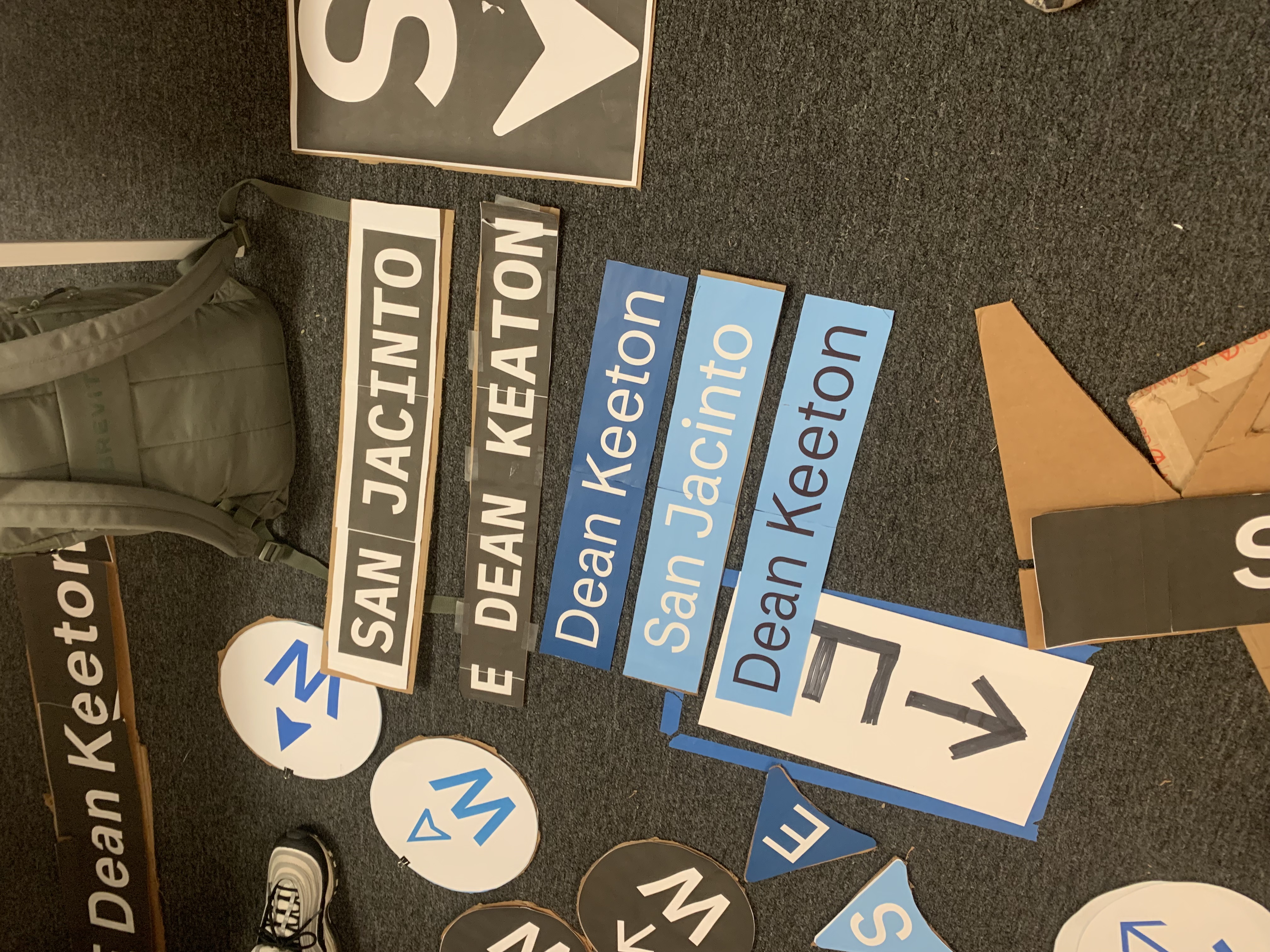
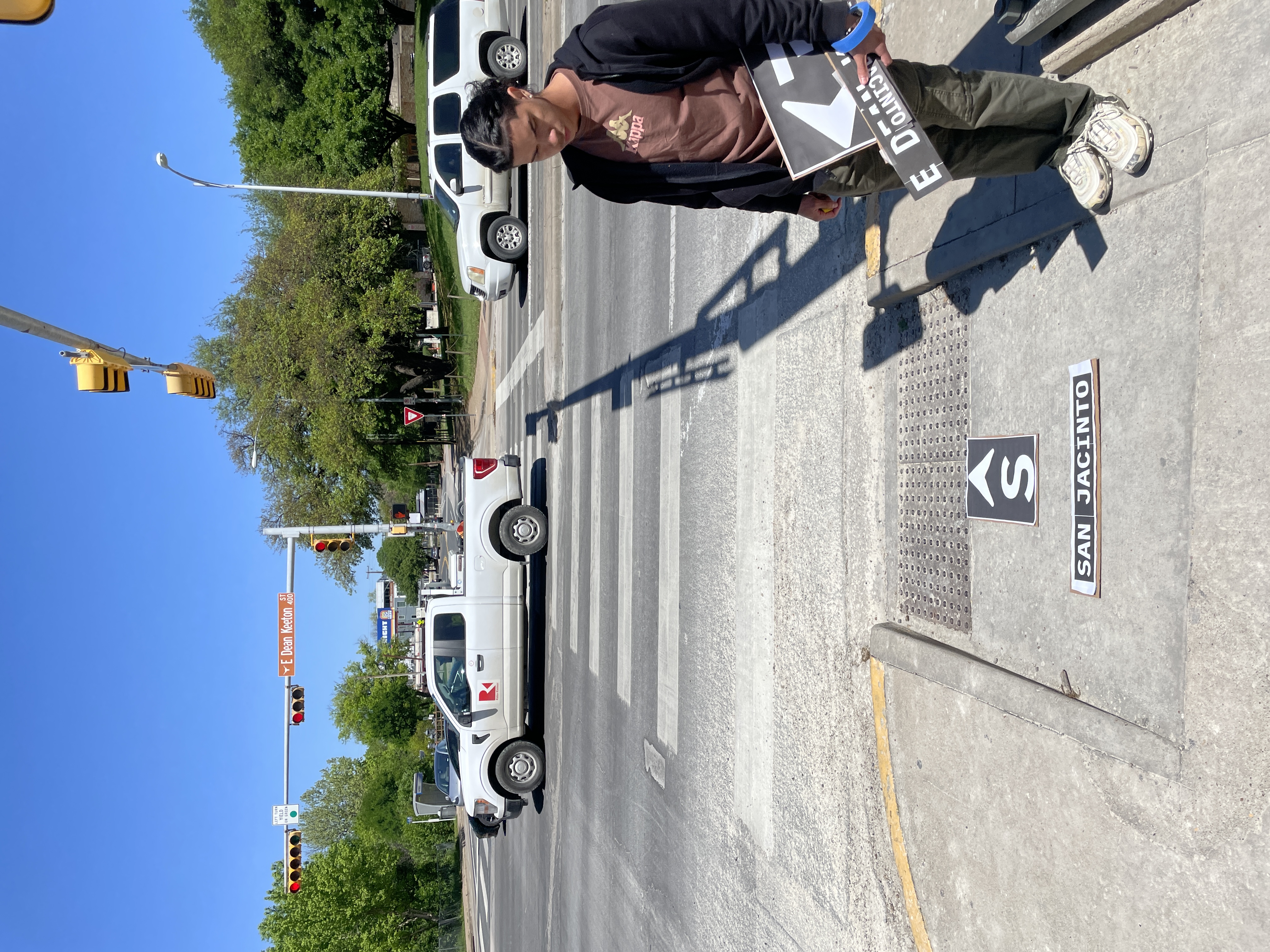
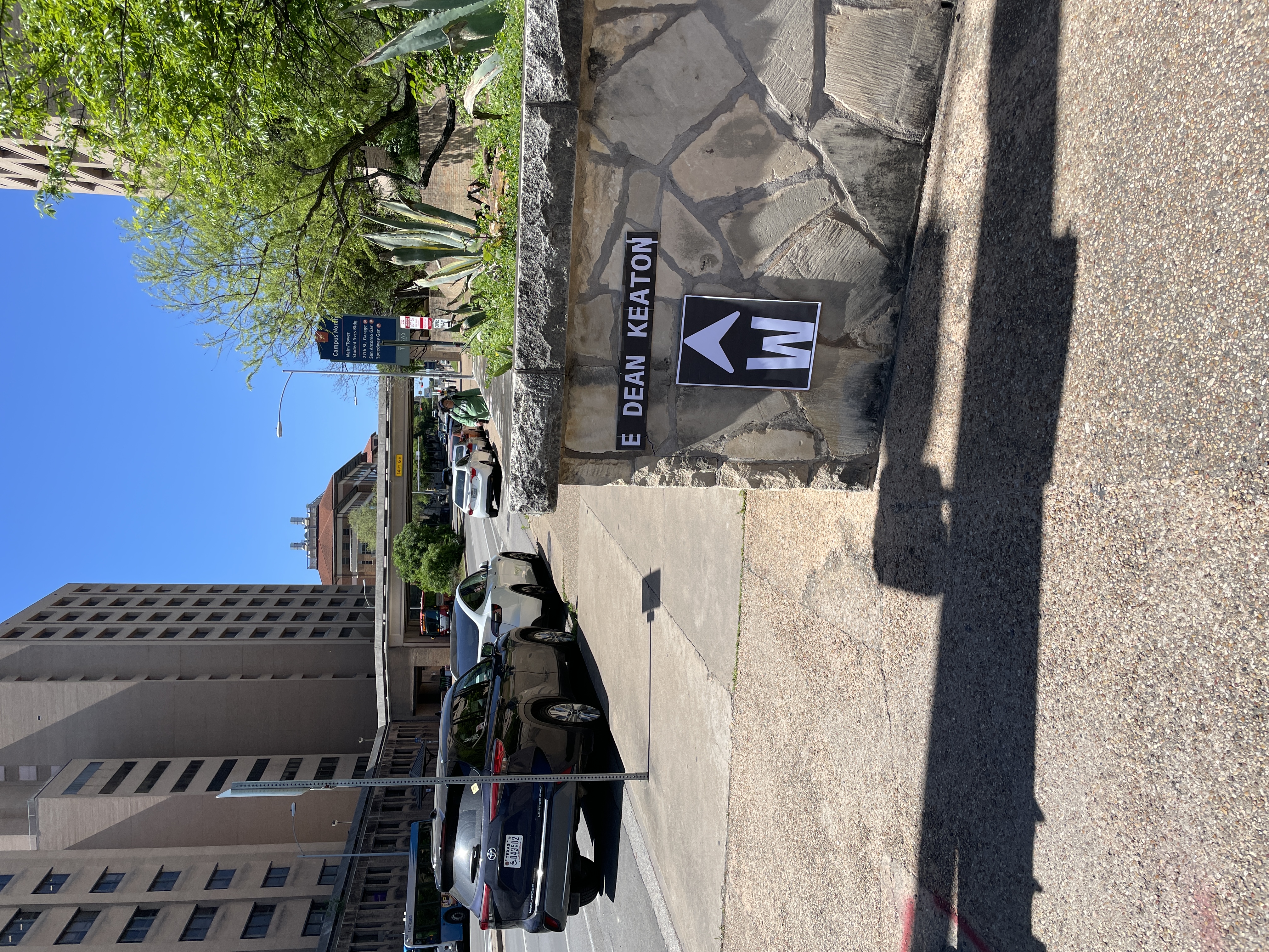
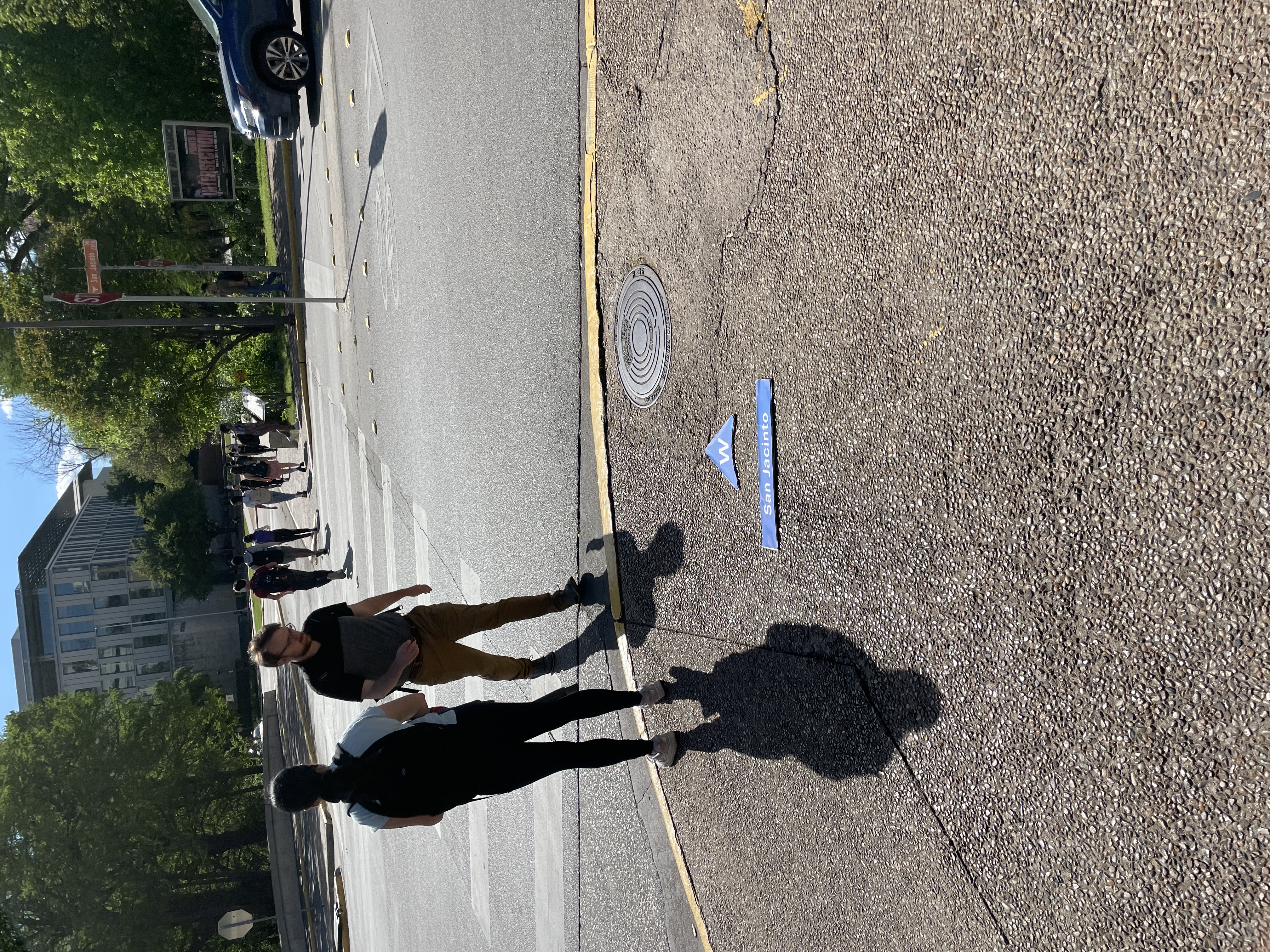
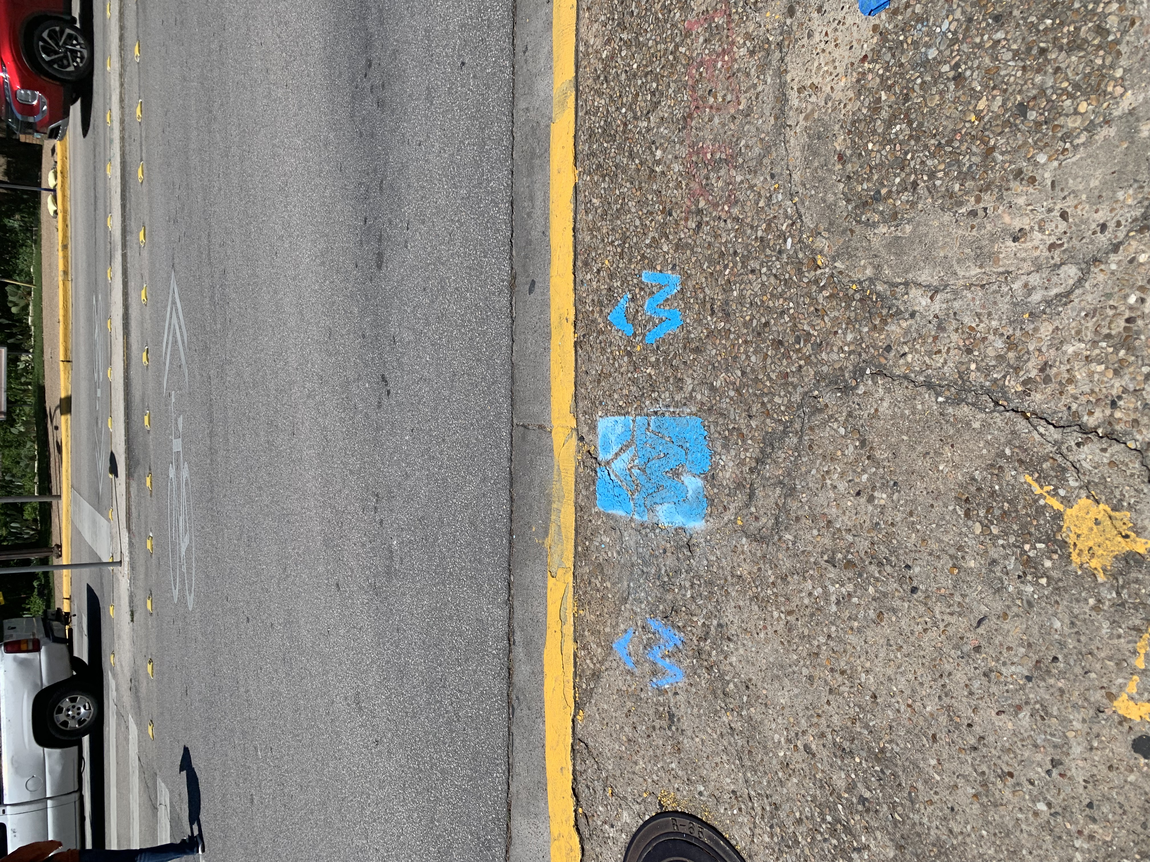
My Focus: Ground-Level Signage
Wayfinding from the Ground Up
I collaborated with Abraham Neiswinter to develop concepts for ground-level signage. Our focus was on wayfinding tools that guide users from the floor—specifically through the use of cardinal directions, arrows, and street names.
This approach enhances accessibility and usability, especially for people who tend to look down while navigating, whether due to mobile phone use or visual comfort.
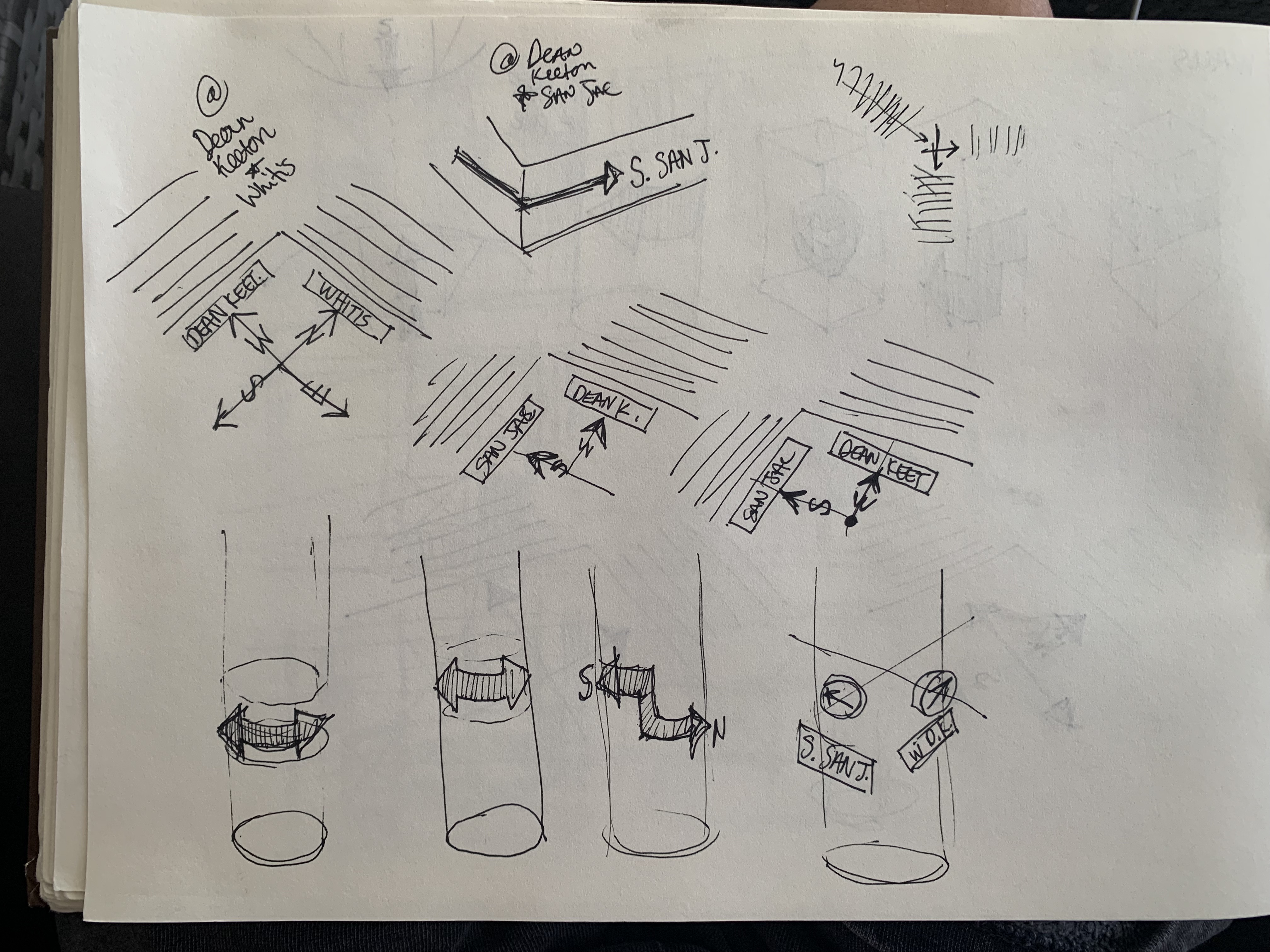
Ground Signage Concepts
Digital Mockups
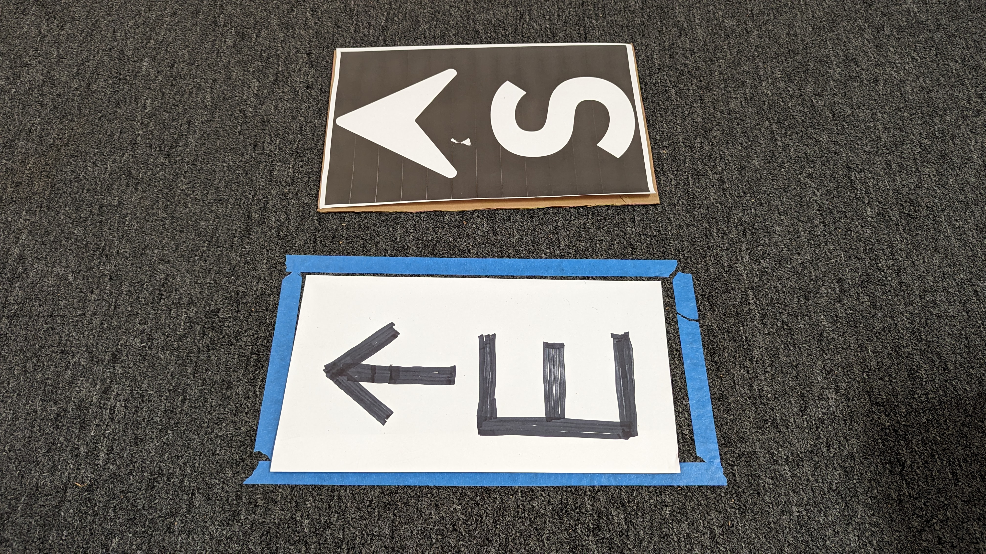
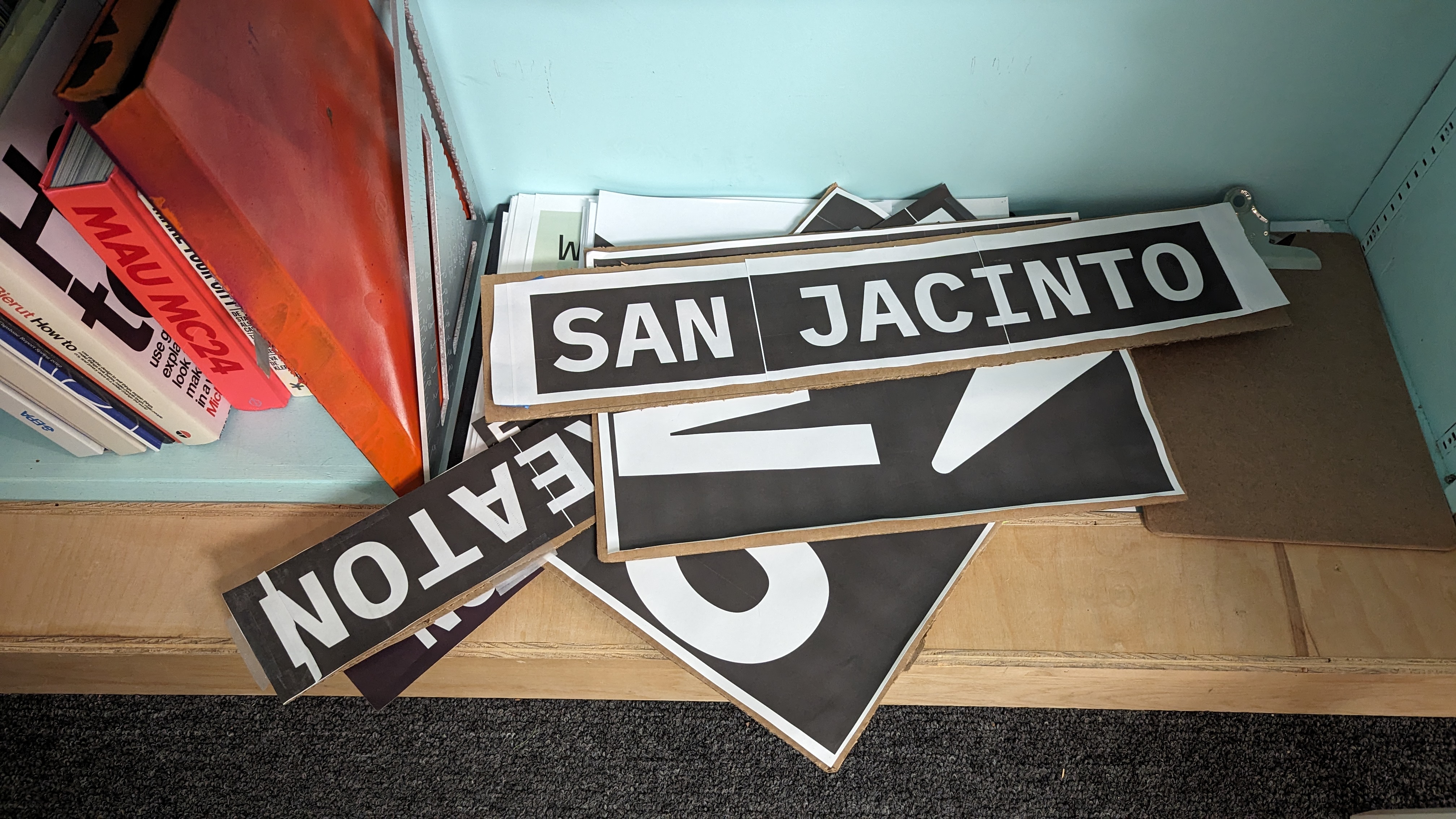
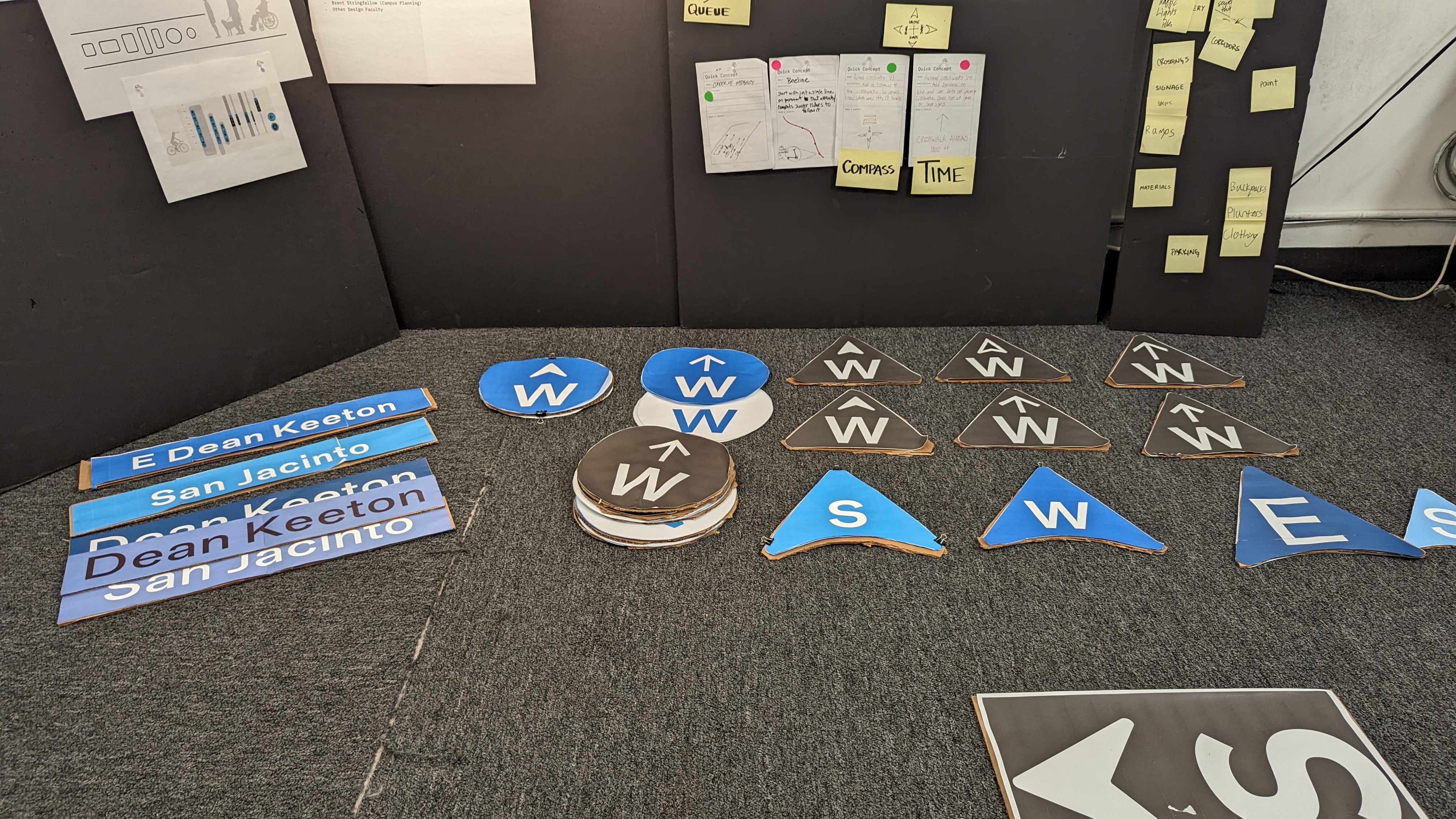
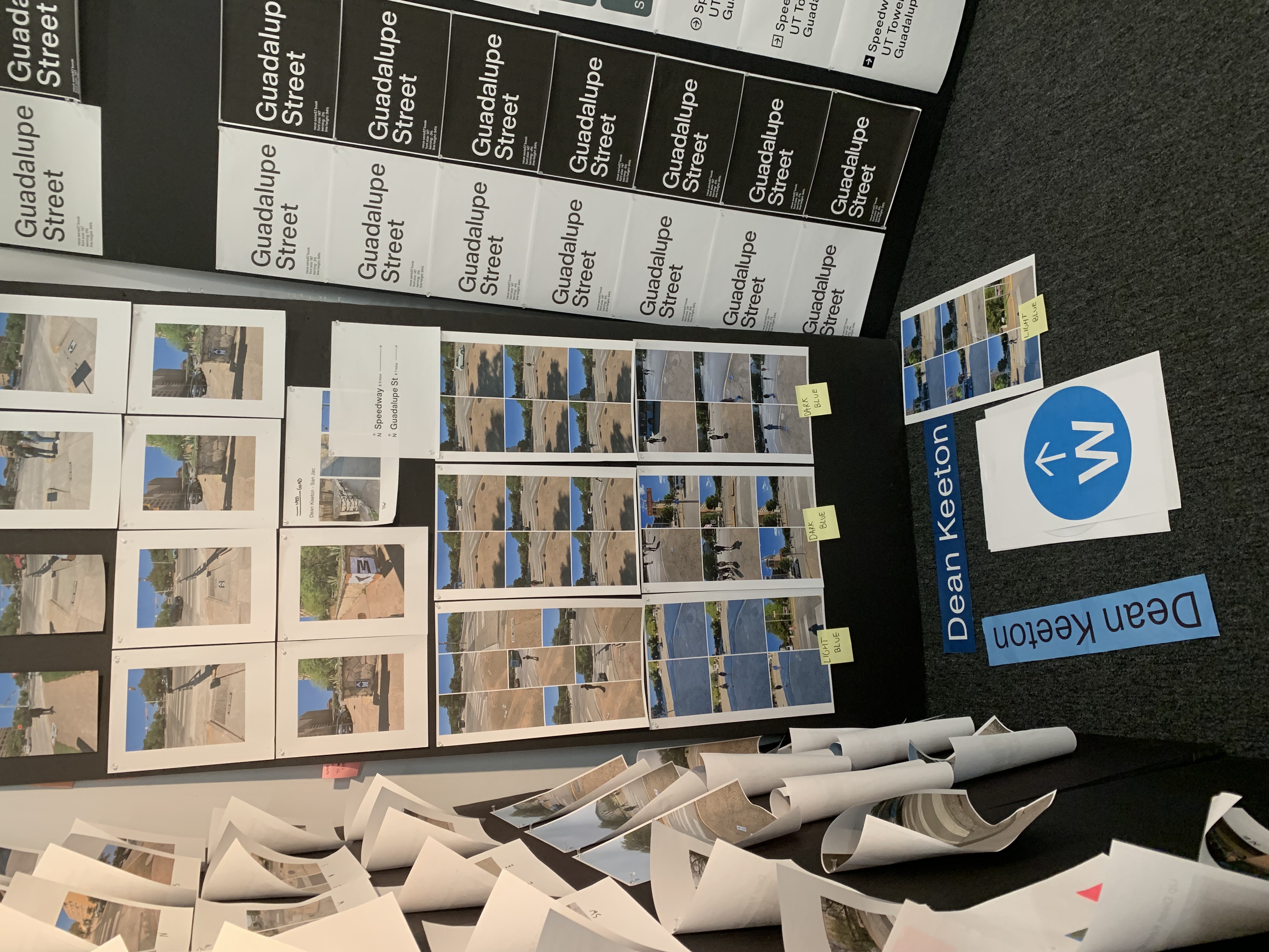
Phase Three: Prototyping
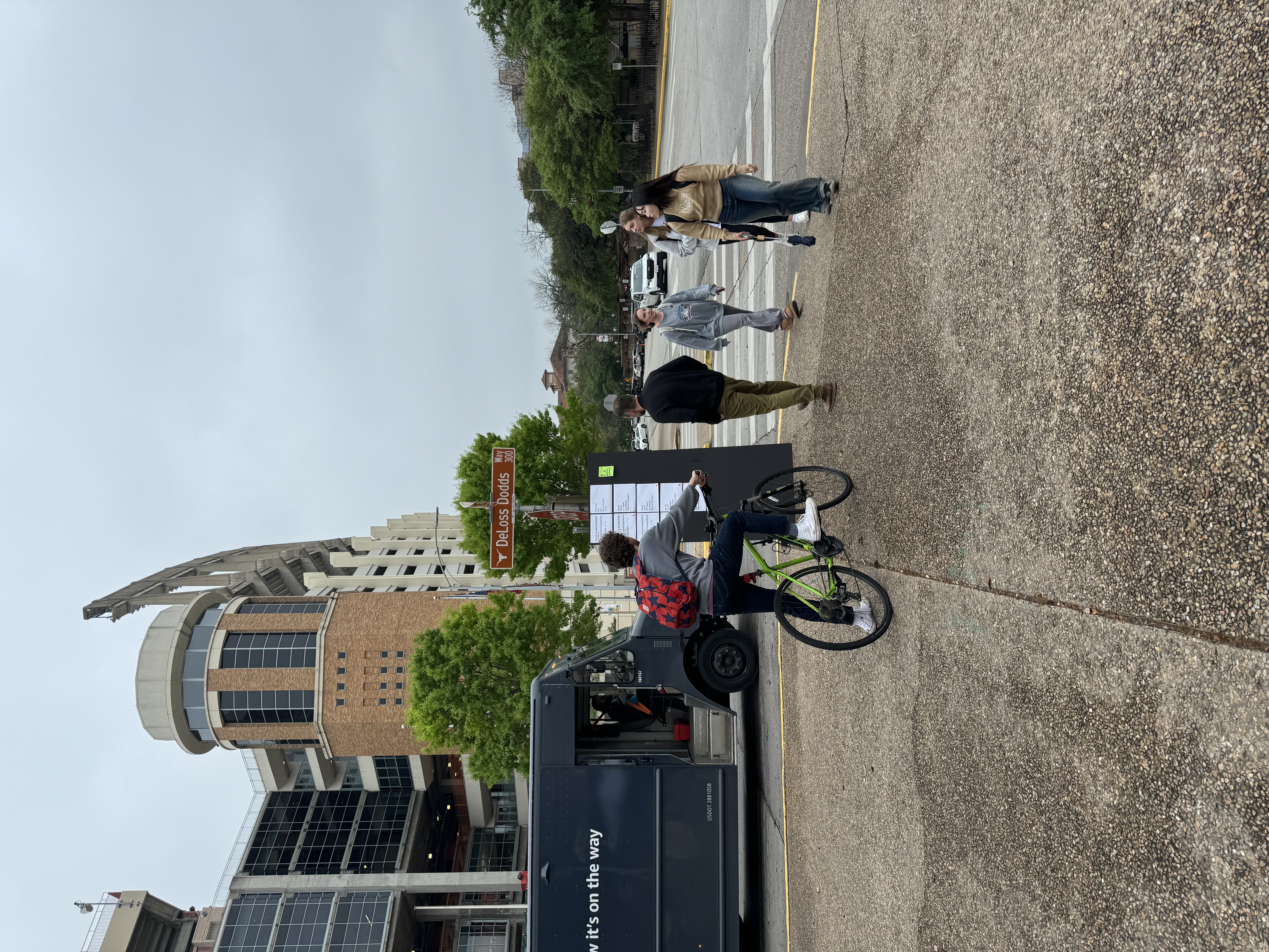
In this phase of the process, we translated our sketches into a low-fidelity prototype. We printed our designs at actual scale and mounted them on cardboard for testing.
The goal was to create something tangible we could place in the environment to evaluate its usability and begin answering upcoming research questions.
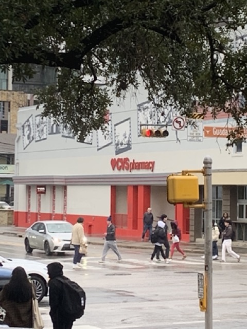
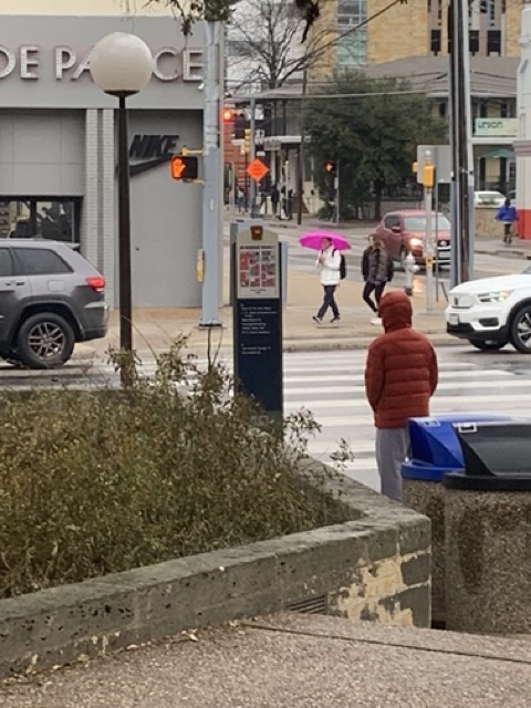
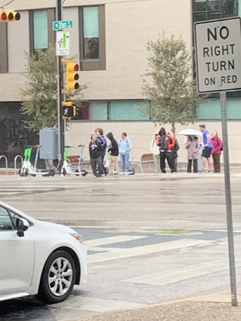
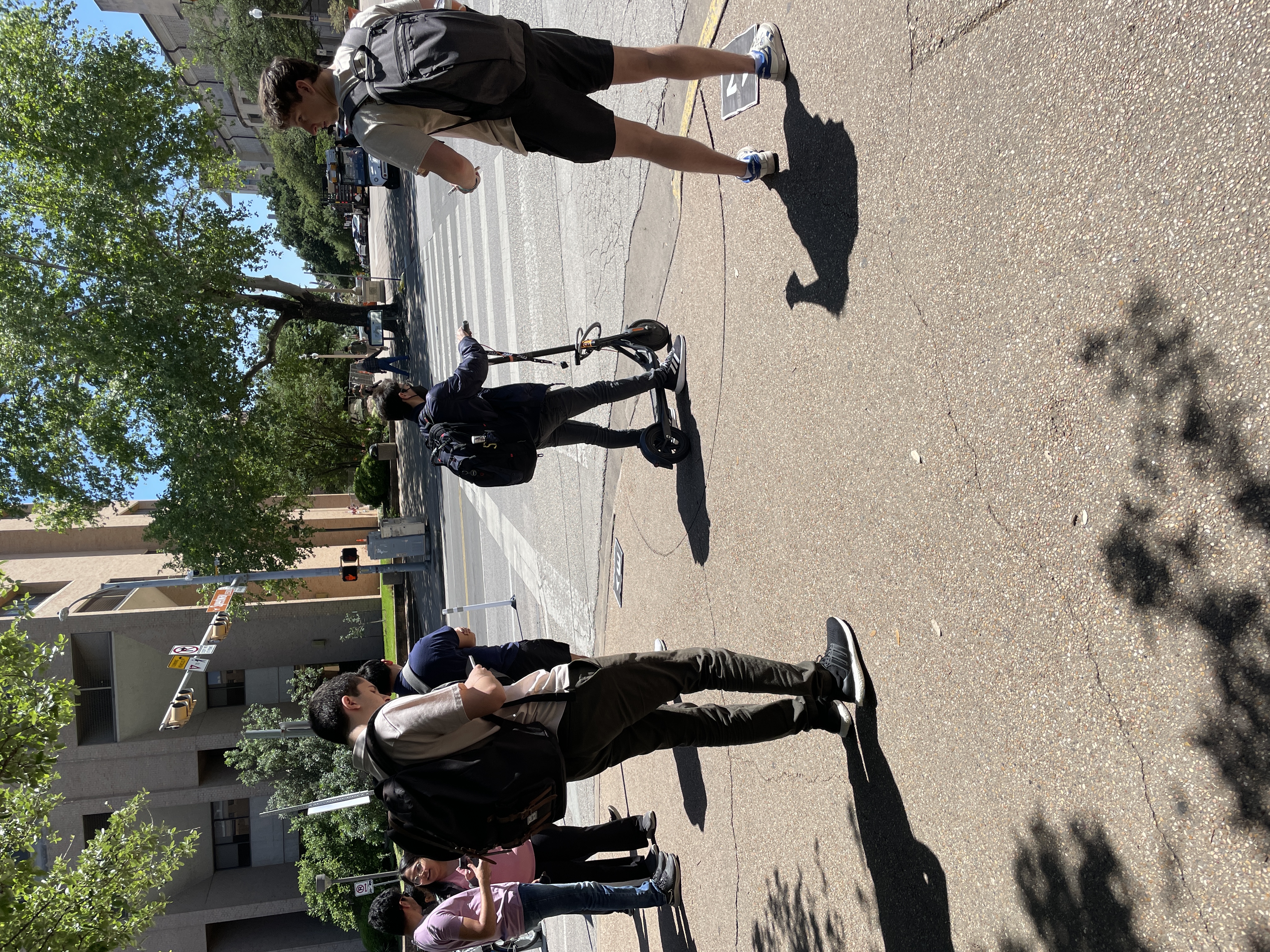
Phase Four: Testing
Research Questions: Ground-Level Signage
Abraham Neiswinter and I conducted user testing with our prototypes, aiming to evaluate their effectiveness through the following research questions:
1. Do you know what direction you're heading?
We asked participants if they could identify the cardinal direction they were heading in to test spatial awareness.
2. What street are you on?
This helped us determine whether our signage effectively communicated street names.
3. Did you notice the signs on the ground? Why or why not?
After students crossed the street, we asked if they noticed the ground-level signage behind them and what made it noticeable (or not).
4. What caught your attention first?
We wanted to learn whether participants noticed the cardinal direction indicators or street names first.
5. What do you think the sign was for?
This question helped assess whether the signage’s intended purpose—to orient users—was clear.
Results/Findings
Our testing showed that the ground-level signage successfully informed students about the direction they were heading and the street they were on. Both the cardinal directions and street names were interpreted easily and effectively.
The color choice—especially the use of light blue—significantly increased visibility and noticeability. Many users mentioned the color helped the signs stand out against the concrete and surrounding environment.
The material and texture of the signage also played a role in user interaction. Because the signs were slightly raised or visually distinct, several students reported avoiding stepping on them—showing that the ground elements were indeed noticed.
However, positioning influenced effectiveness. In some instances, the signage was missed due to foot traffic or because people were rushing. During peak hours, crowded sidewalks often obstructed the view of the signage.
Interestingly, prior knowledge of the area reduced reliance on signage. Some students didn’t notice or engage with the signs simply because they already knew where they were going.
A few participants admitted they didn’t notice the signs at all—often due to distractions, urgency, or simply looking at their phones. This highlights an ongoing challenge in catching attention in busy environments.
Overall, our findings support the use of ground-level signage as a helpful, accessible, and intuitive wayfinding tool, while also revealing areas for improvement in placement and visibility.
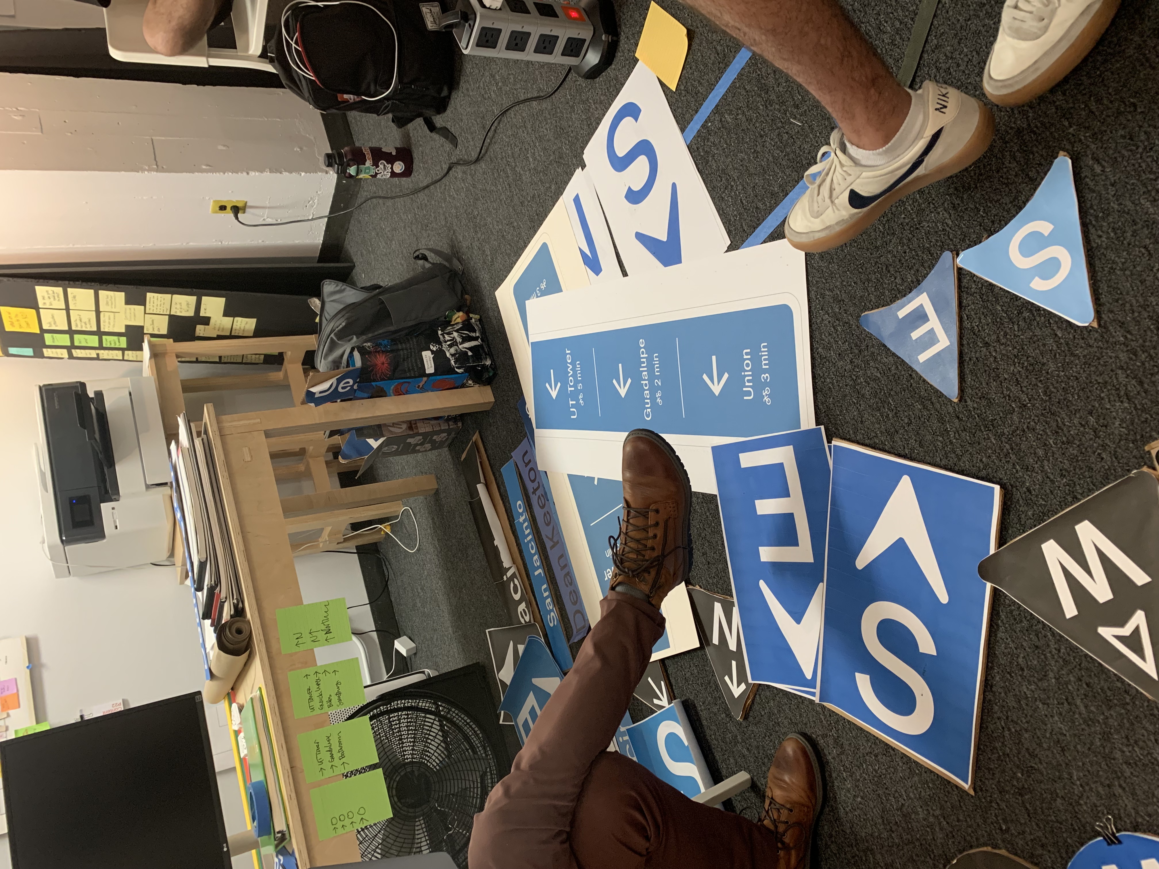
Additional Testing
In addition to our primary testing, we assisted with several tests conducted by other teams. These included both physical prototypes and public engagement exercises.
Vertical directional signage was placed in public areas to observe interaction and gather feedback. The public responded positively—many noted that the signage clearly communicated direction and was easy to interpret.
We also laid out multiple typographic and signage variations for public review. This helped us gauge which designs were most effective in terms of visibility, clarity, and overall aesthetic.
These tests offered valuable insight and reinforced our direction for design decisions moving forward.
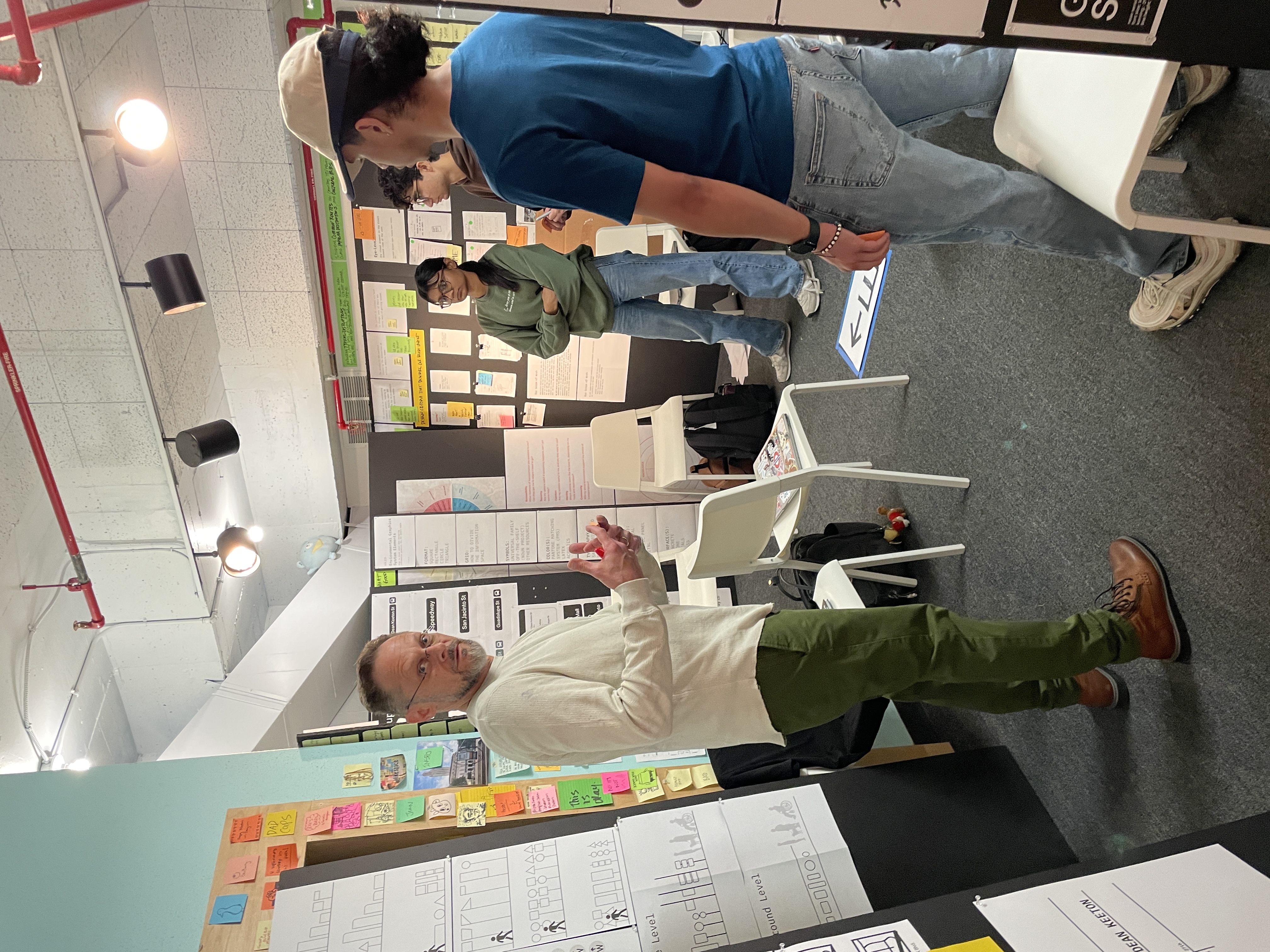
Final Presentation
Scroll to View
Presentation Day Reflection
We had the opportunity to present our research and proposed signage solutions to the University of Texas at Austin Campus Planning team—made up of architects, engineers, and urban designers. Their feedback was both constructive and encouraging, reinforcing the importance of pedestrian-first wayfinding.
Our conversation touched on the materials, placement, and practical applications of our ground-level signage. One of the key moments was when the team acknowledged a current gap:
“The signs we have at traffic lights are for cars—nothing for pedestrians. These are for pedestrians.”
They also provided helpful guidance on map integration and directional placement. Even though this kind of work has been explored before, our approach aligned with professional best practices—a sign we’re on the right path.
Overall, the opportunity to present and receive feedback from professionals was both validating and deeply appreciated.
Key Takeaways
Project Takeaways
Collaboration is essential – Effective teamwork enhances problem-solving, strengthens ideas, and ensures a well-rounded approach.
The design process is iterative – Ideation and prototyping aren't linear. Iteration and ongoing refinement lead to stronger, more thoughtful outcomes.
Clarity and accuracy matter – Consistency in presentation is critical. Stakeholders notice discrepancies, so attention to detail is a must.
Seek feedback regularly – Constructive criticism and peer insights are crucial to improving your work at every stage.
Stakeholder engagement is key – Regular check-ins help align expectations and allow room for course correction before it's too late.
User-centered design is crucial – The needs of real users should drive design decisions. Design doesn’t exist in a vacuum.
Flexibility leads to innovation – Be open to evolving your ideas based on feedback, especially when testing reveals new perspectives.
Presentation skills are vital – Effectively communicating your work ensures it is understood, respected, and considered for real-world application.
Designing for everyone is challenging – A solution that works for one group may not work for another. True accessibility means aiming to include the widest possible audience.
Wayfinding systems require time and care – Designing new navigation tools takes extensive prototyping, testing, and revision.
Recommendations
Expand accessibility research – Include considerations for users with visual, auditory, and mobility impairments to inform more inclusive solutions.
Explore textures and materials – Investigate the tactile and functional aspects of signage, especially for ground-level installations.
Assess real-world application – Consider durability, maintenance, and environmental factors in selecting materials and signage placement.
Study campus "districts" – Break down the campus into key zones or “districts” to guide signage strategy and improve spatial clarity in maps.
Conduct more prototype testing – Run additional field tests focused specifically on accessibility and gather input from users with different needs.
Iterate designs based on feedback – Continue refining prototypes in response to both public feedback and expert critique.
Opportunities for Growth
Expand ideation and experimentation – Don’t settle too early. Explore more concepts through sketches, prototypes, and alternate approaches before narrowing down solutions.
Enhance stakeholder collaboration – Involve stakeholders earlier to gain insights that can influence direction and clarify expectations from the start.
Improve testing and validation – Conduct more rounds of user testing to refine details, validate assumptions, and ensure the design is truly effective.
Strengthen documentation – Maintain consistent records of your research, iterations, and critiques. This improves transparency and informs future decisions.
Refine time management – Strive for a better balance between speed and depth. Being intentional with your time leads to stronger outcomes.
Develop creative resilience – Not every idea will work. Embrace setbacks as part of the process and use them to grow your thinking and adapt your strategy.
Think long-term – Consider the lifespan of your design decisions and how they integrate with broader campus initiatives or infrastructure plans.
Outcomes – WkRM Wayfinding & Ground Signage
User & Stakeholder Validation
- Direct Client Feedback: Presented mockups and concepts to stakeholders and received input that informed revisions and design priorities.
- Alignment with User Needs: Refined designs based on pain points and navigation patterns identified during early testing and validation sessions.
Design & Communication Process
- Collaborative Ideation: Worked within a group to brainstorm, sketch, and develop signage systems based on real-world context and user flow.
- Visual Hierarchy & Legibility: Prioritized clarity and accessibility in typography, iconography, and layout decisions tailored for outdoor use.
- Prototyping & Presentation: Developed presentation materials and mockups that communicated how the signage would work within the space.
Professional Development
- Client-Facing Experience: Gained confidence presenting ideas and incorporating professional feedback in a fast-paced team environment.
- Iterative Design Thinking: Demonstrated flexibility and openness to redesign based on constraints and external input.